PROJECT NOTES
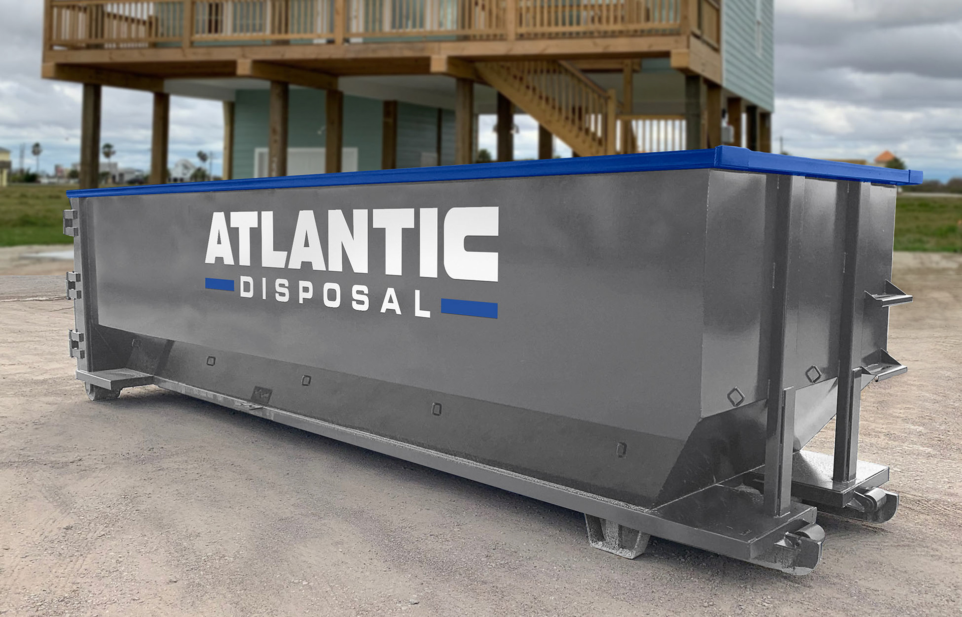
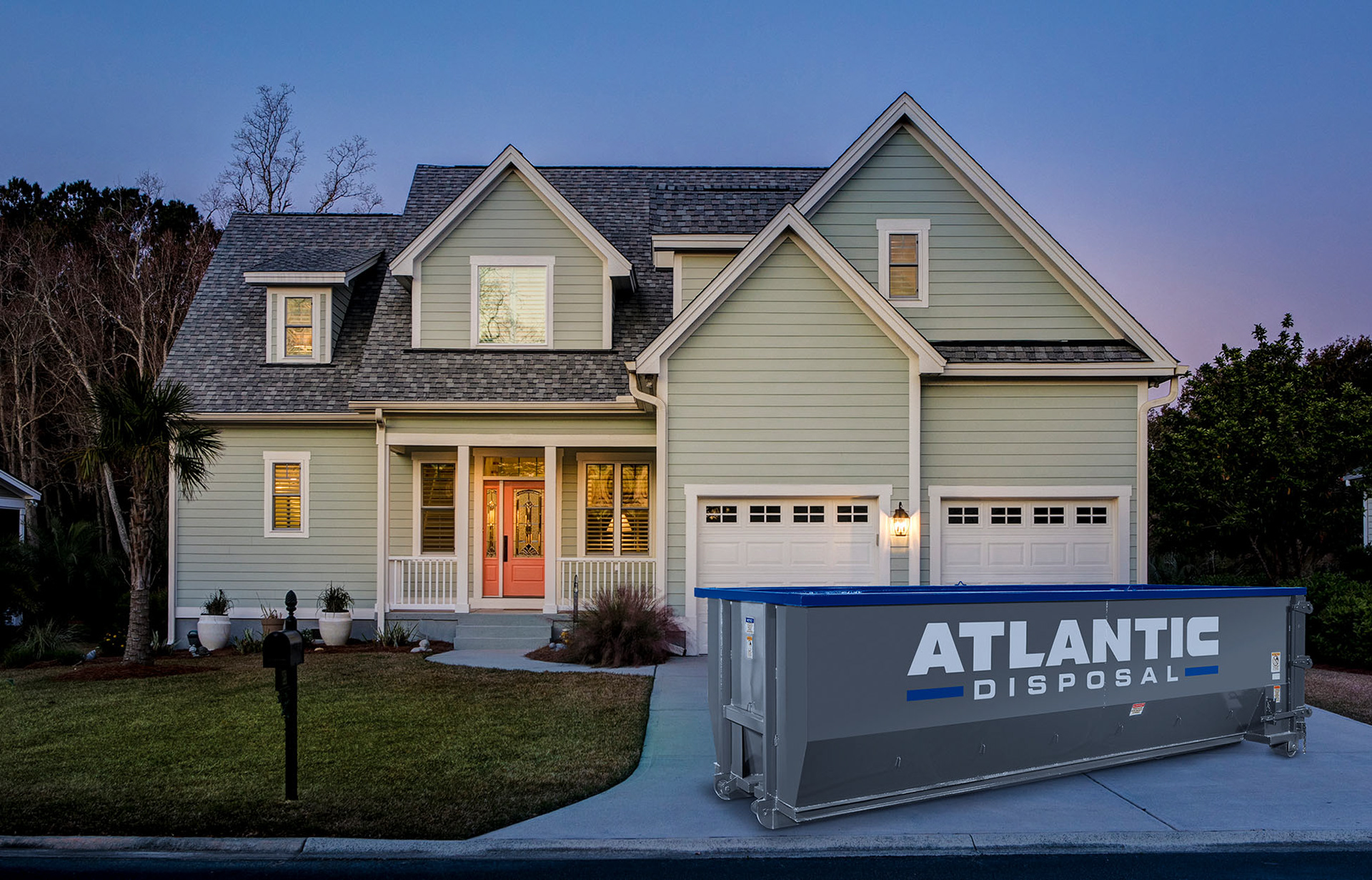
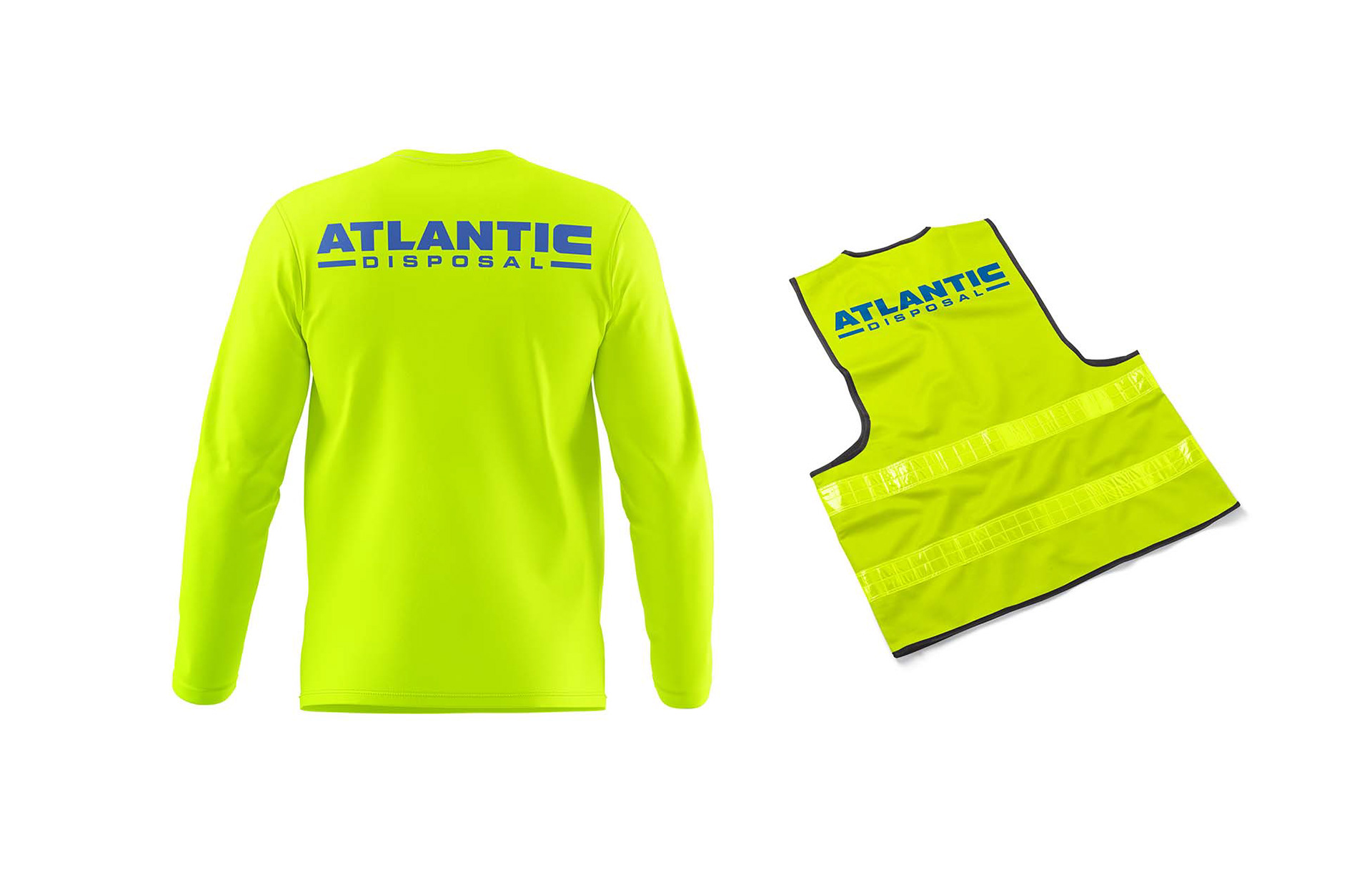
Atlantic Disposal is a roll off dumpster service in North Florida and as they were still in the prelaunch stage of the new company, they needed everything to do with branding for the start-up. For the logo we started with a few quick Q&A sessions to understand what was needed, how the logo would be used, where it would live in the field and what production processes would be used to reproduce the logo. Turns out the easiest and most cost effective way to place a large logo on the side of a dumpster is the make a stencil and use spray paint. So, once the dumpsters arrived, the logo needed to conform to the ritual of Krylon applied via stencil. Next trucks were to be purchased and then wrapped with the brand colors and logo. From there, photos needed to be taken during the process of dropping off the dumpsters and maneuvering the trucks on site. These lifestyle images I produced would eventually fill up the pages of the website and social media channels. I worked with the owners to craft the brands voice and message, organize service descriptions and try to answer the most common questions within the page content. Then I built the website, they launched the company and the rest is history. If you are in need of a dumpster service in North Florida, visit Atlantic Disposal to schedule drop-off or pickup today
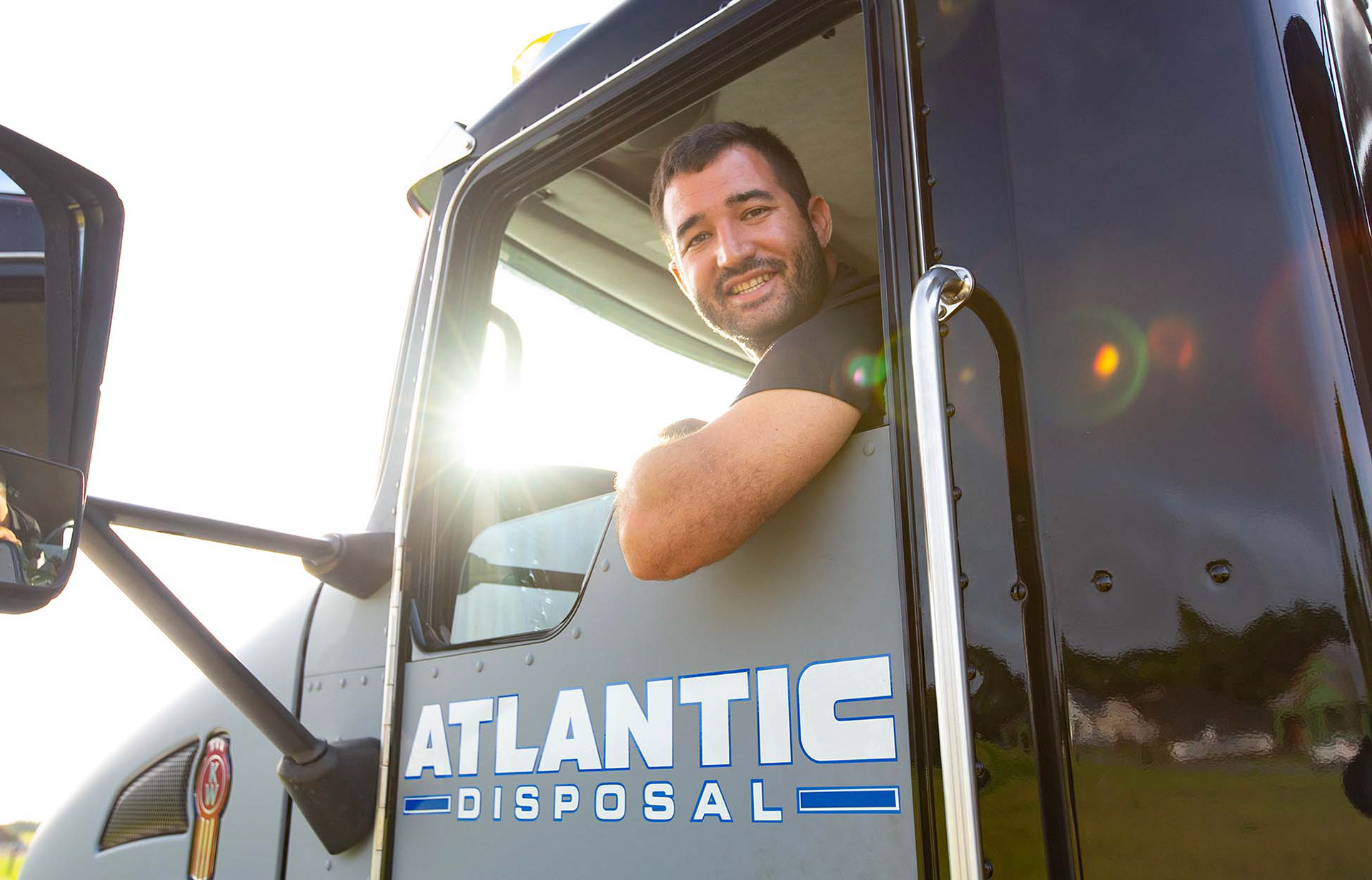
Lifestyle images of company owner
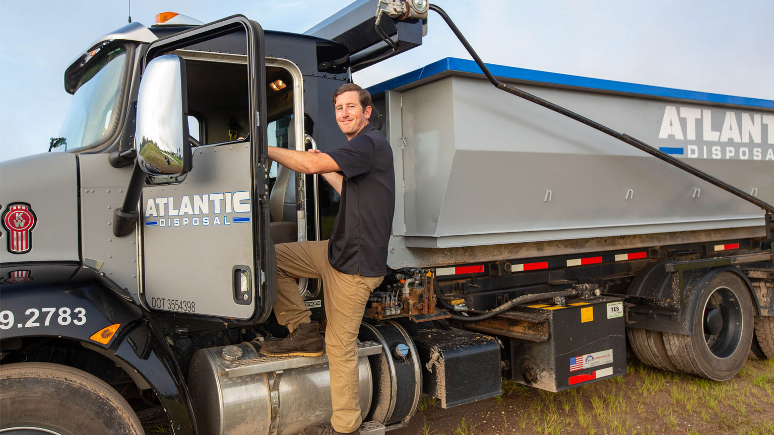
Lifestyle images of company owner
Lifestyle images, beauty shots
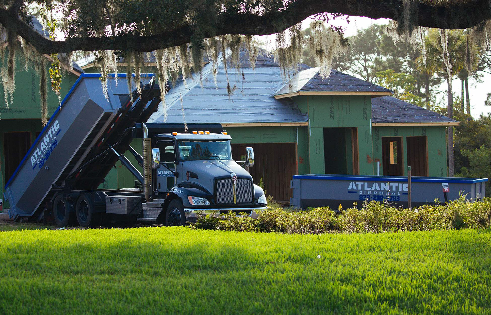
Lifestyle images of dumpster removal
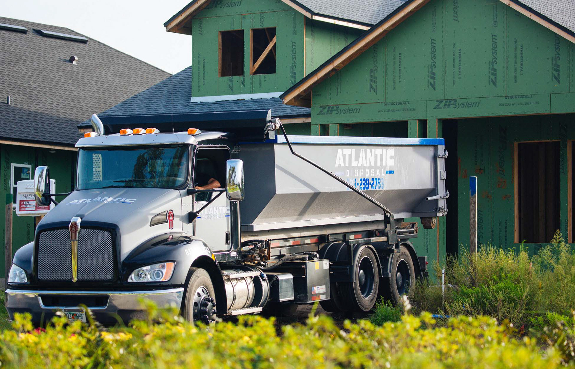
Lifestyle images of on site delivery
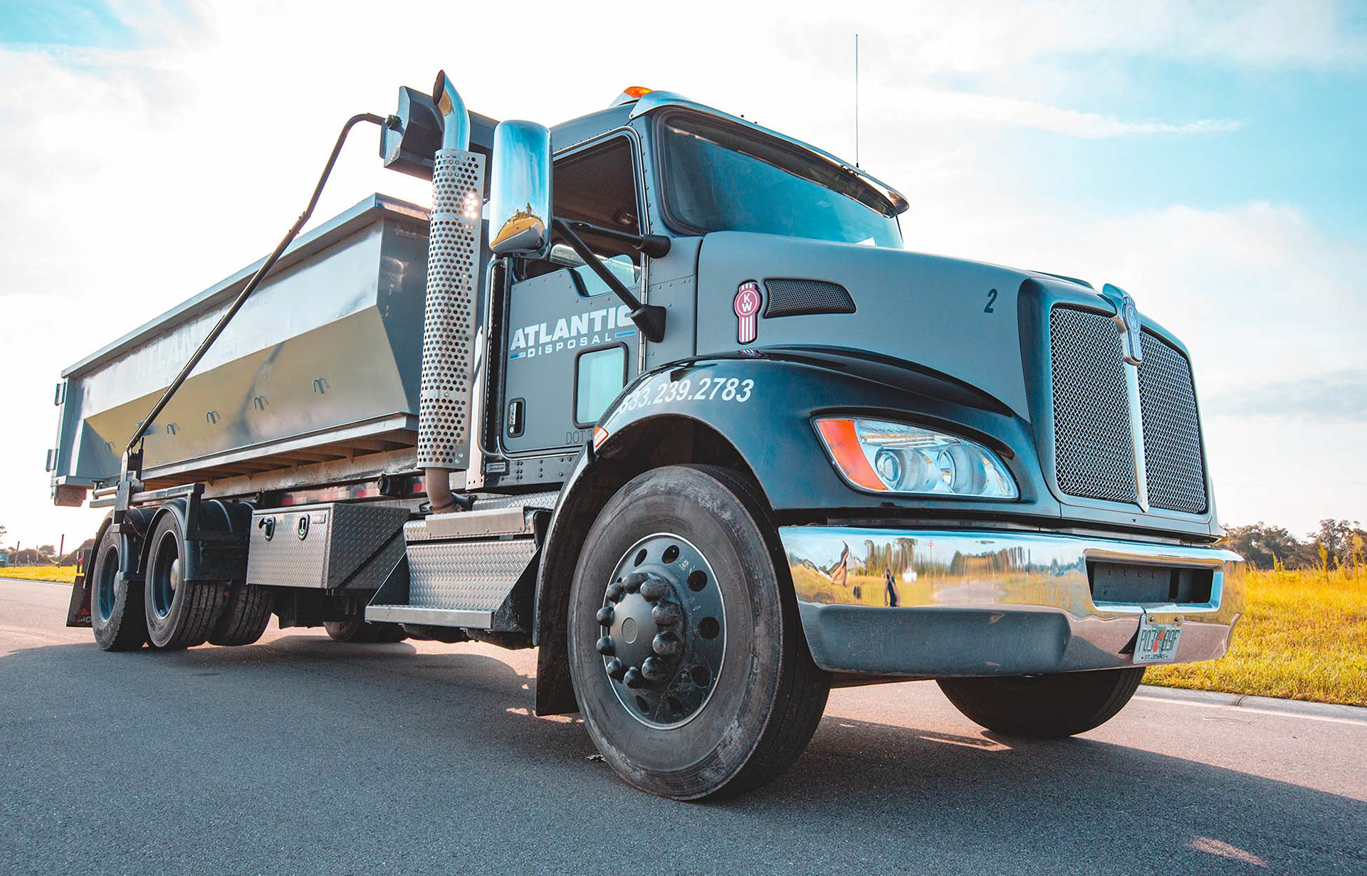
Hero images of the delivery trucks
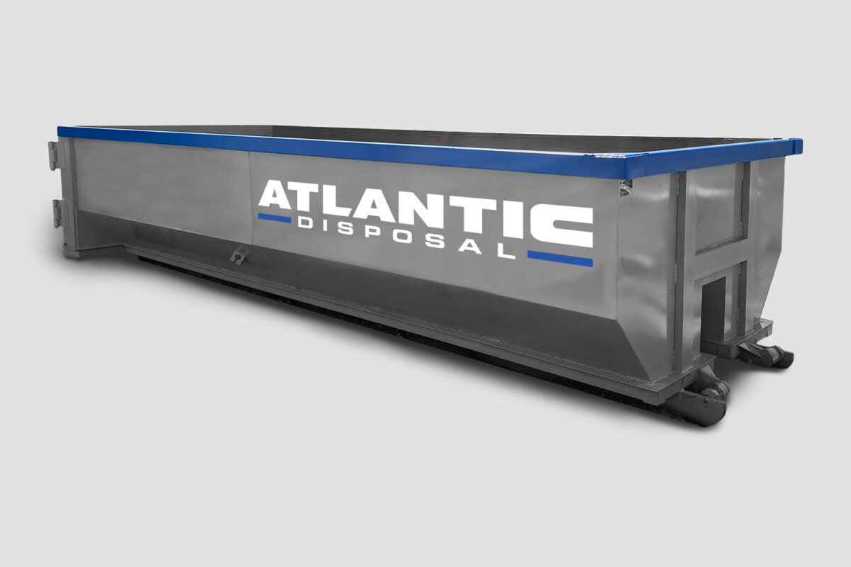
Isolated product images
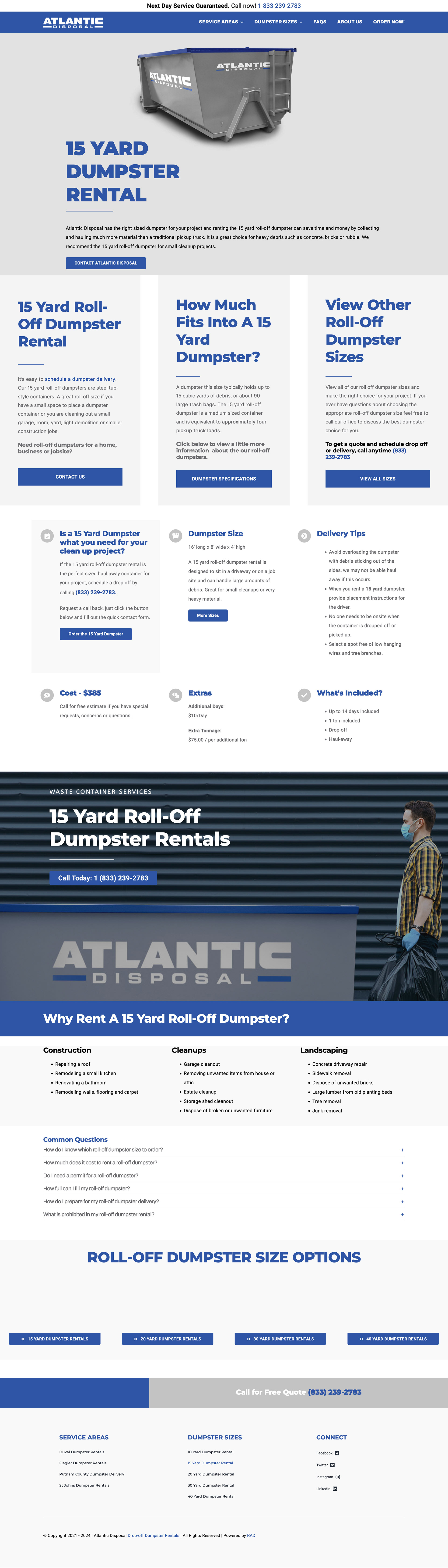
Below is a screenshot of one of the interior pages. During the discovery phase of the project we identified multiple barriers to a customer making a choice about which dumpster to purchase. The main purpose of each of these pages is to answer questions that the customer may have in the decision process, including: cost, what can it be used for, how much does it hold, what can and can't be disposed of in the cans. Aesthetics were a big deal in the project as most competitors websites were cluttered and hard to read and or scan the page for information. I focused on clean typography, plenty of white space, and isolated product images.