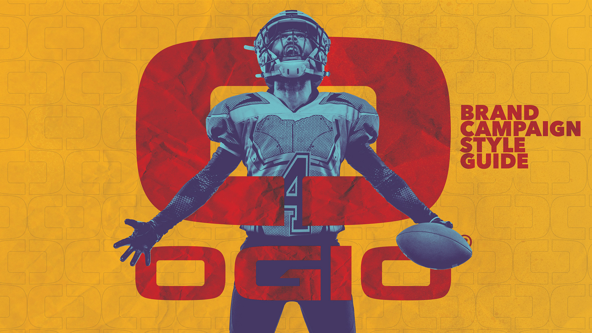
PROJECT BRIEF
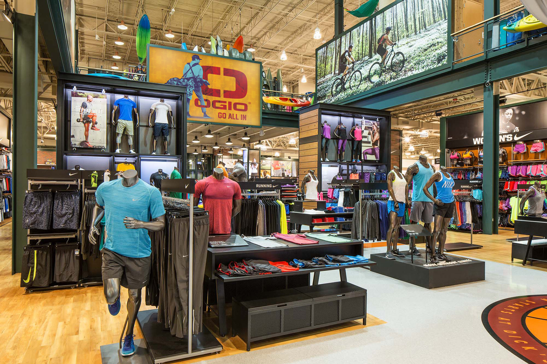
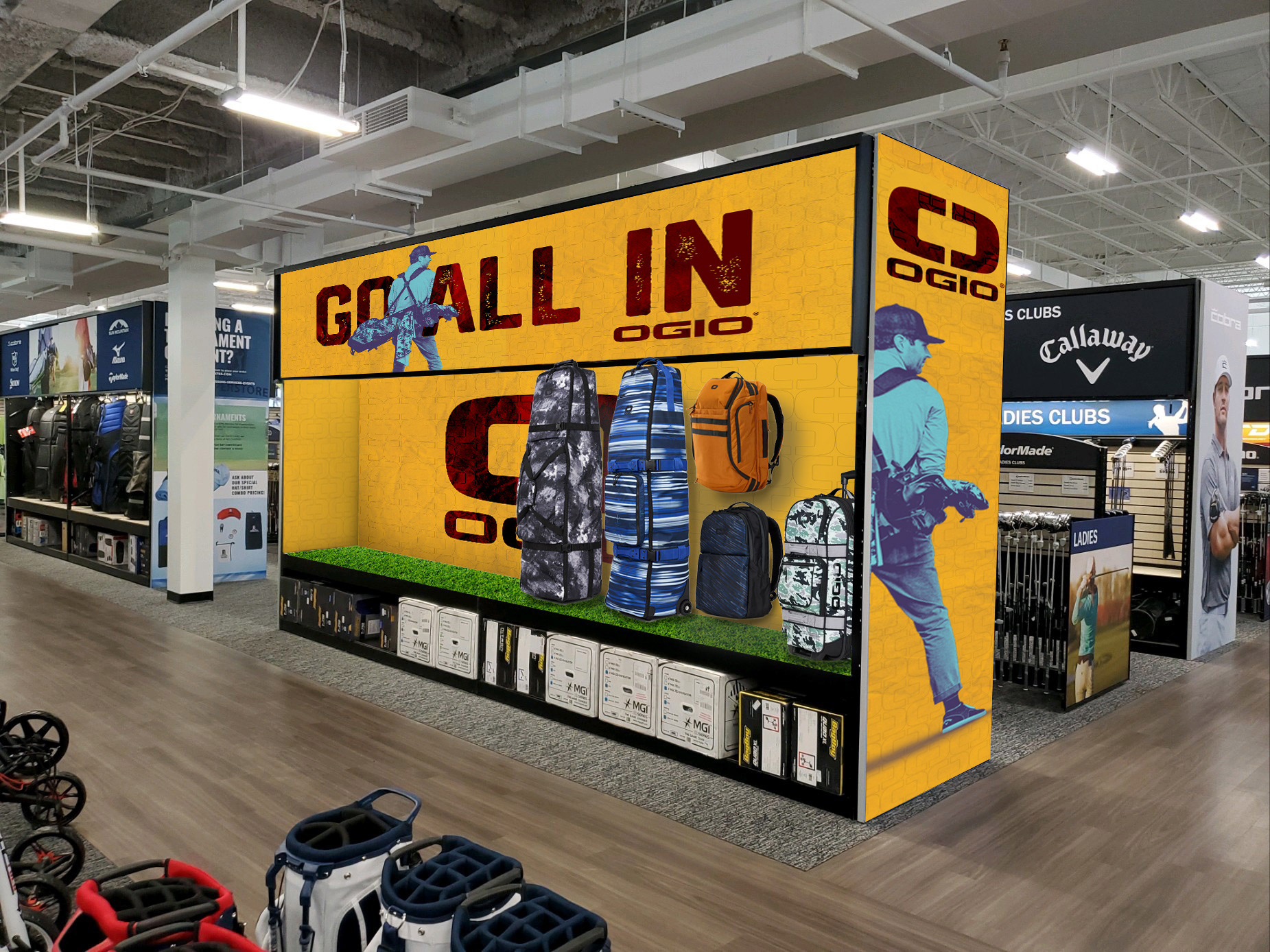
The Creative Director at OGIO reached out and asked if I would be interested in exploring out of the box solutions and new directions for the graphics used to promote the line of high quality bags. We worked closely to really (re)define the target market and more importantly, discovered opportunities to speak to a wider customer base through a design aesthetic and consistent messaging. My role was to assist in defining what needed to be included in the manual, create visuals that perfectly illustrate those concepts, design a page layout that presented these visuals in an intriguing way, develop the order/flow of the content, co-write the copy and finally build out two versions (for print and 16:9 for digital presentation). Below are a few pages from the 2022 OGIO Brand Manual which would become the visual standards guidelines. This was a very rewarding project in terms of how well it was received by the customer. It was a great project to wear many creative hats and flex all of my strategic muscles.
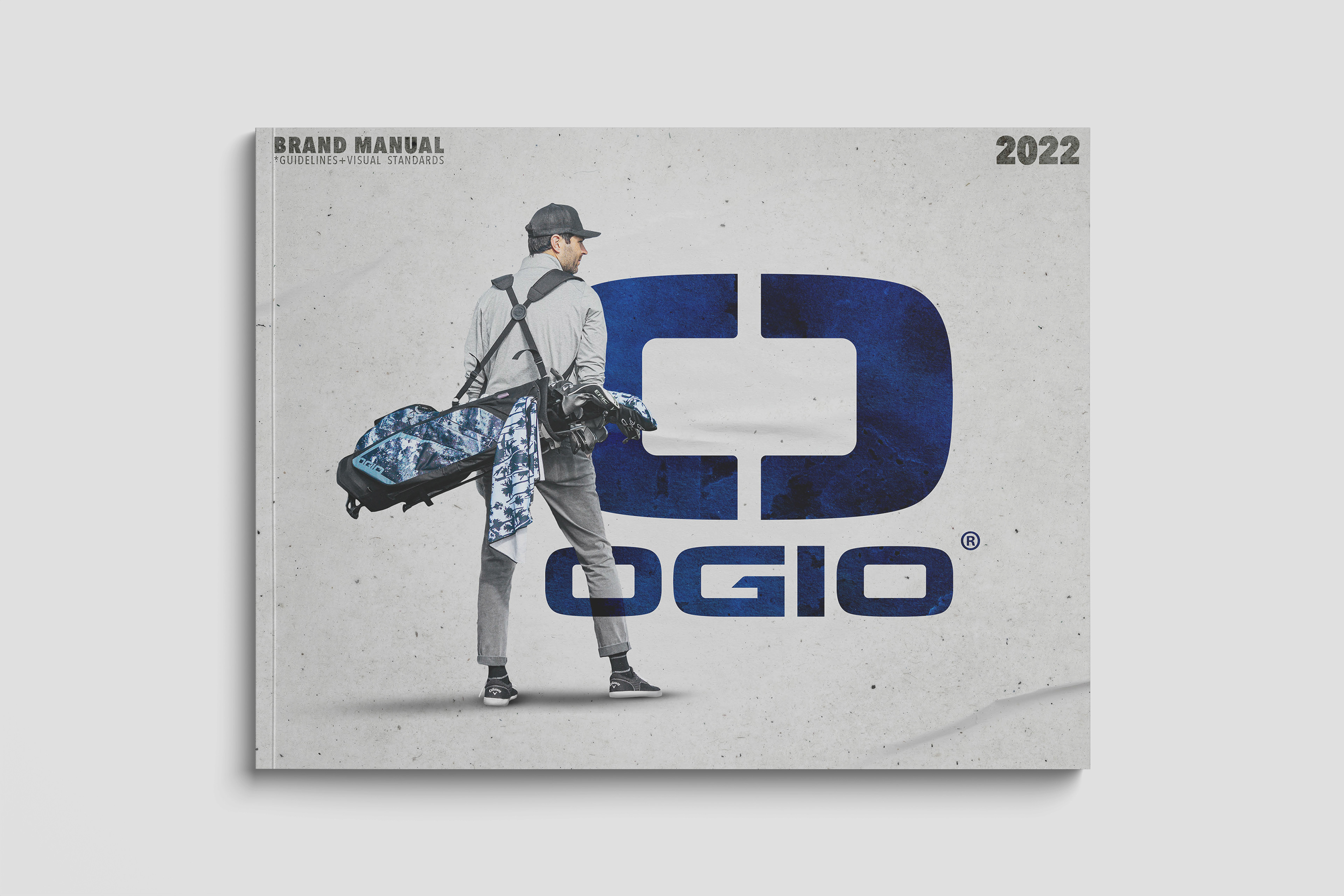
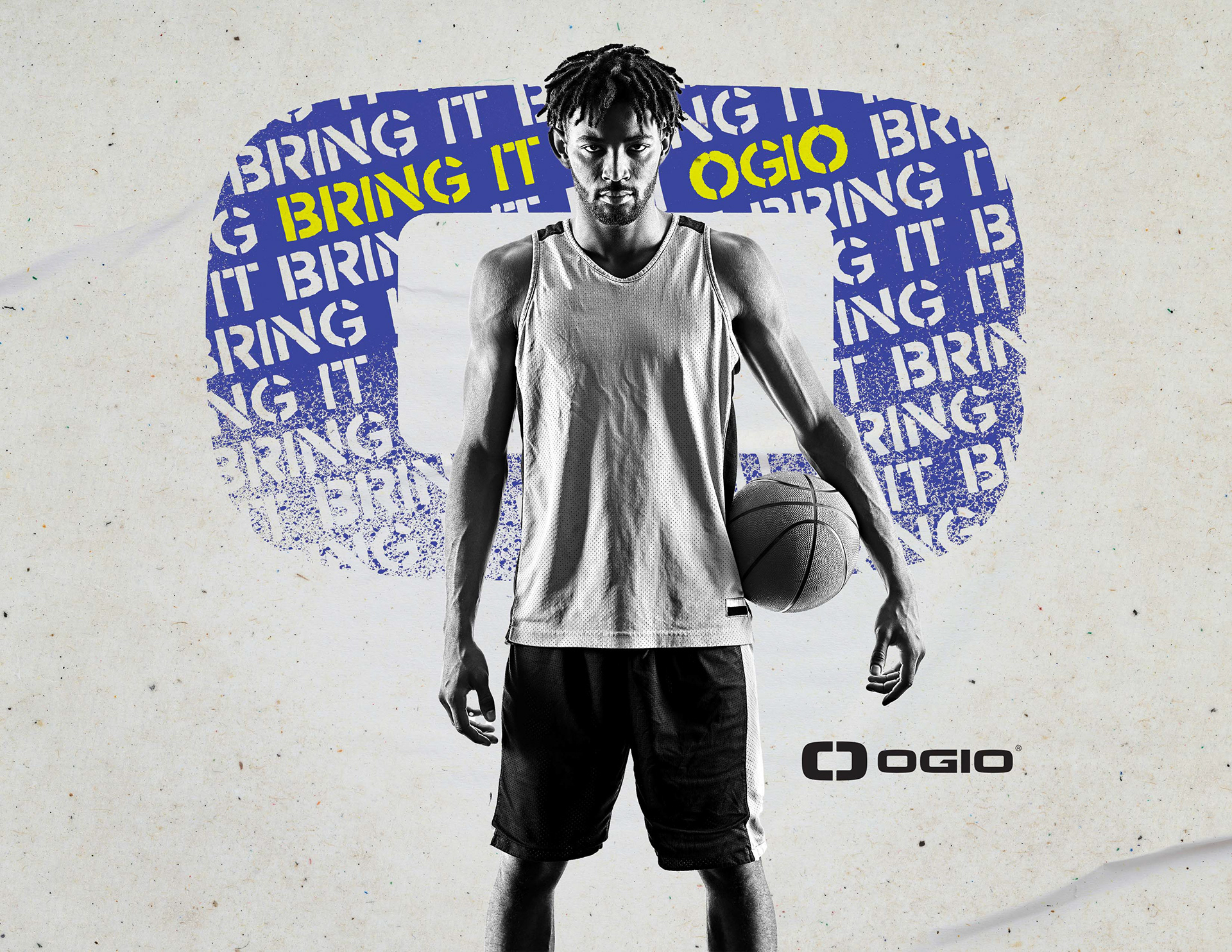
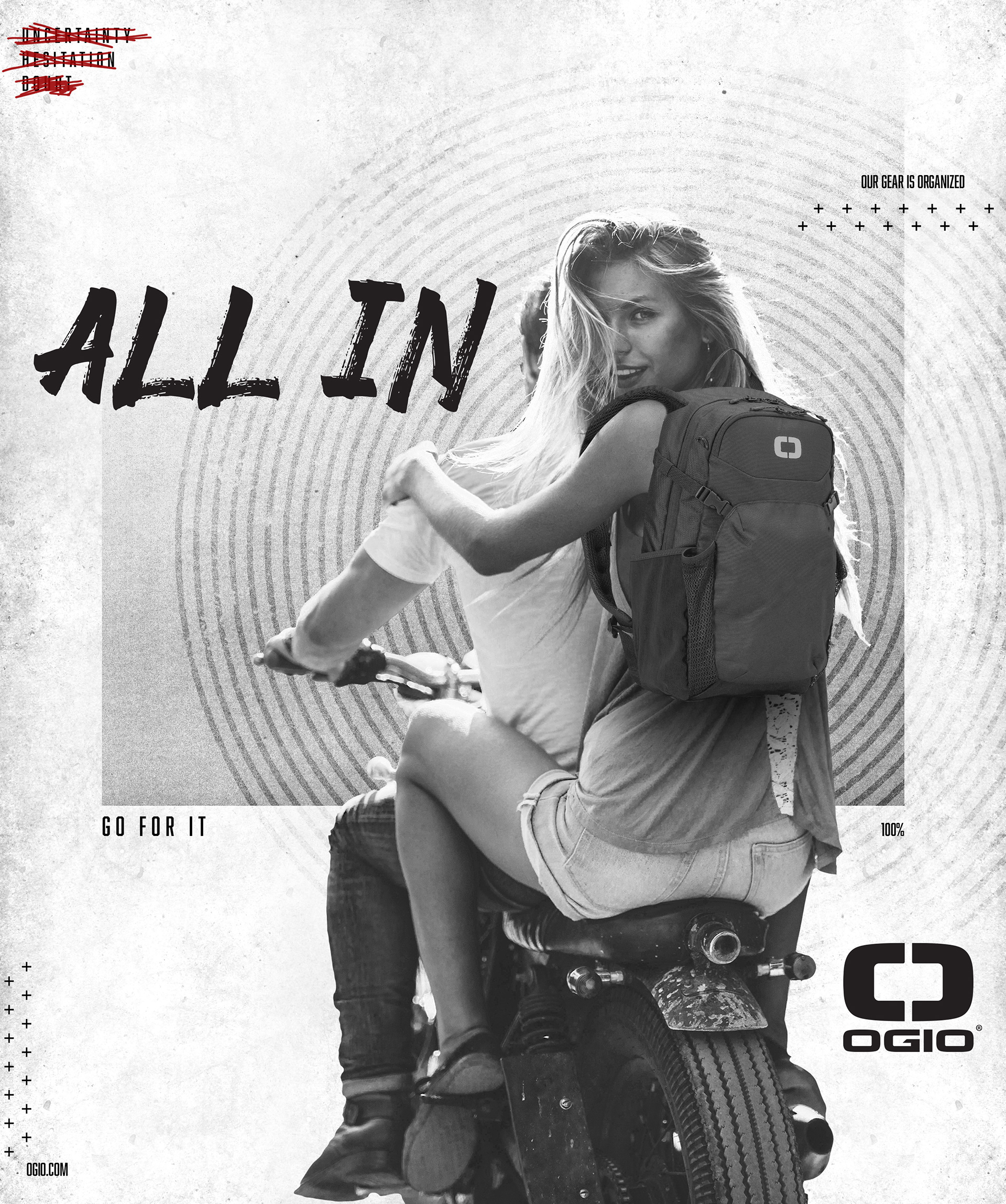
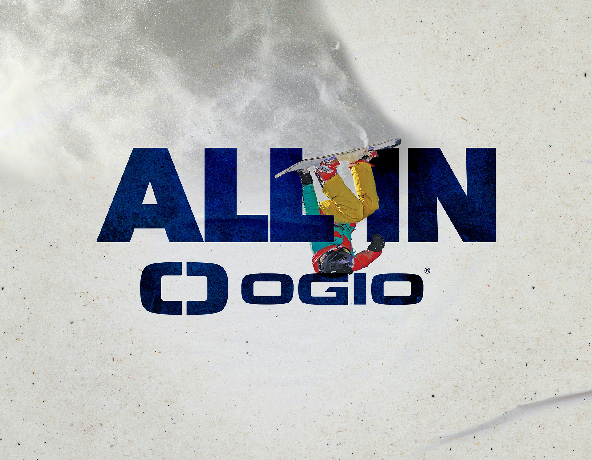
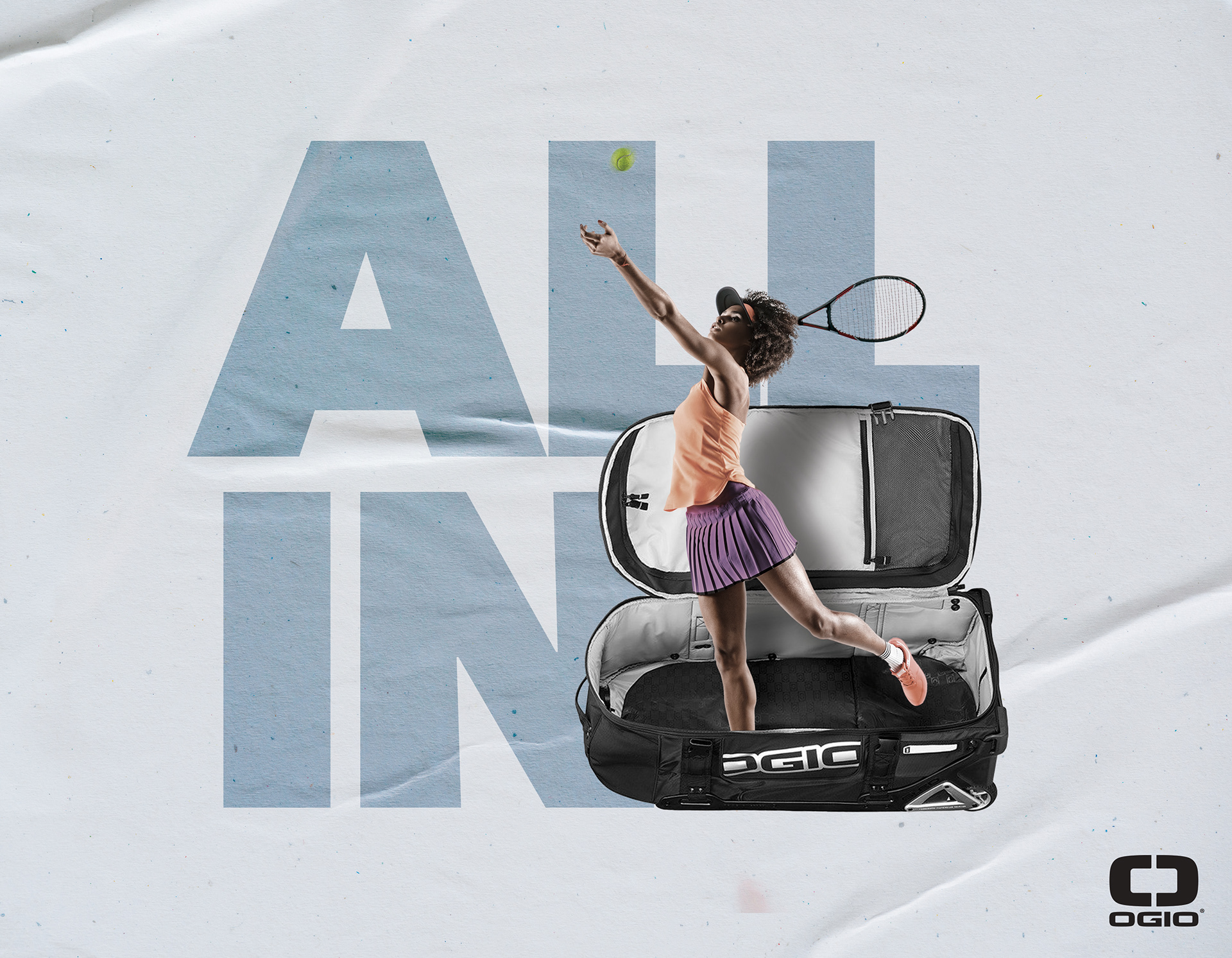
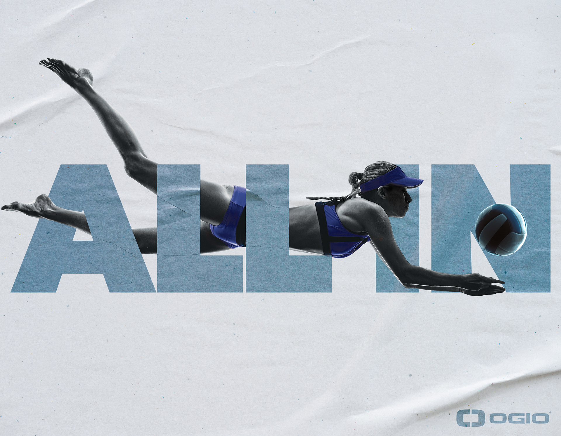
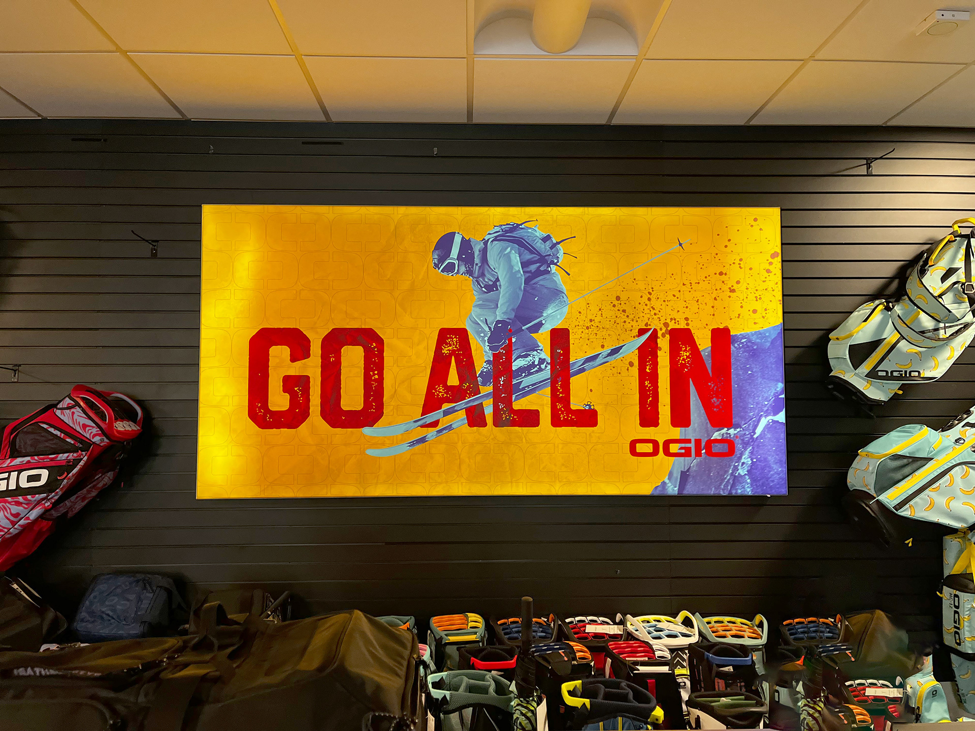
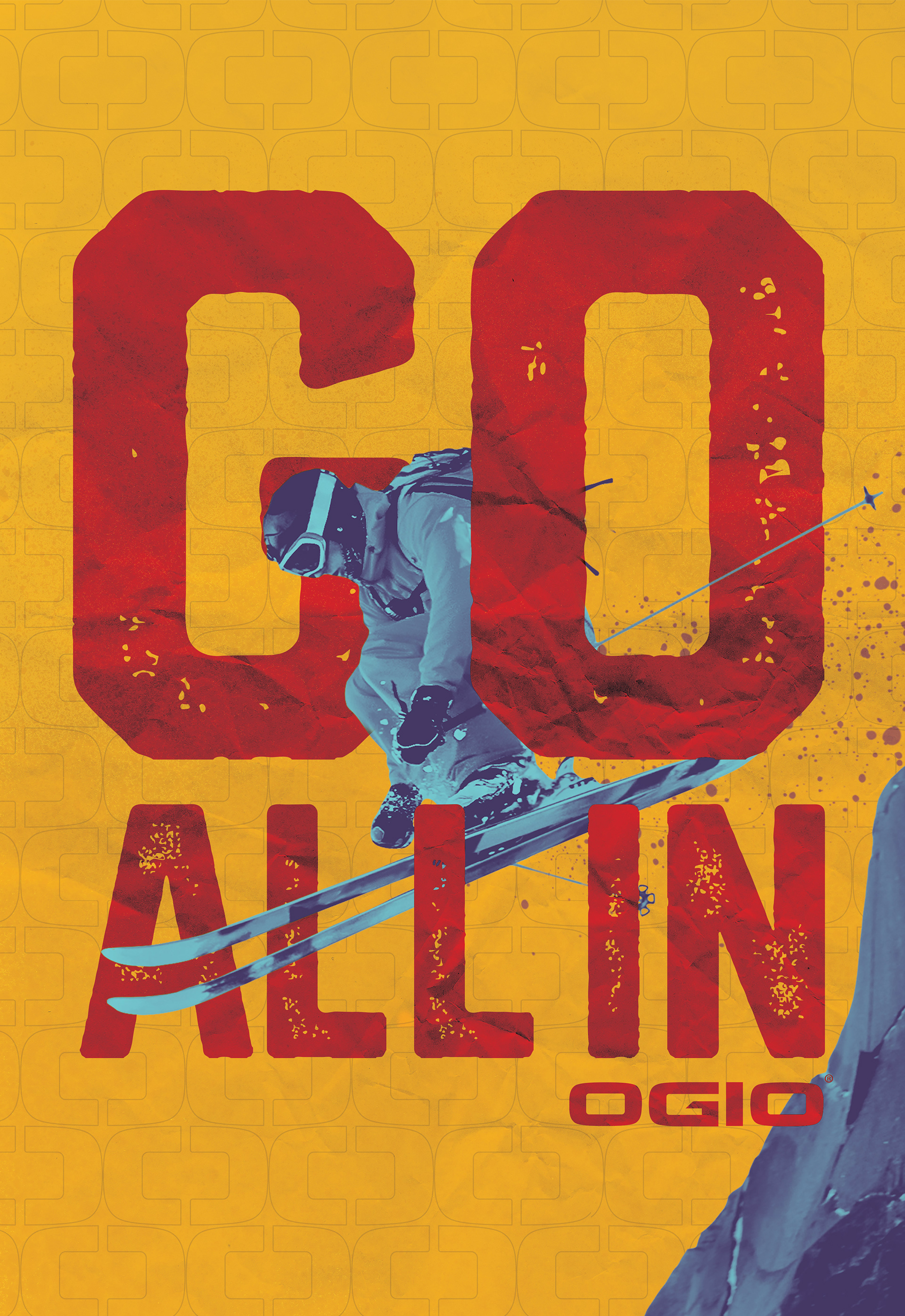
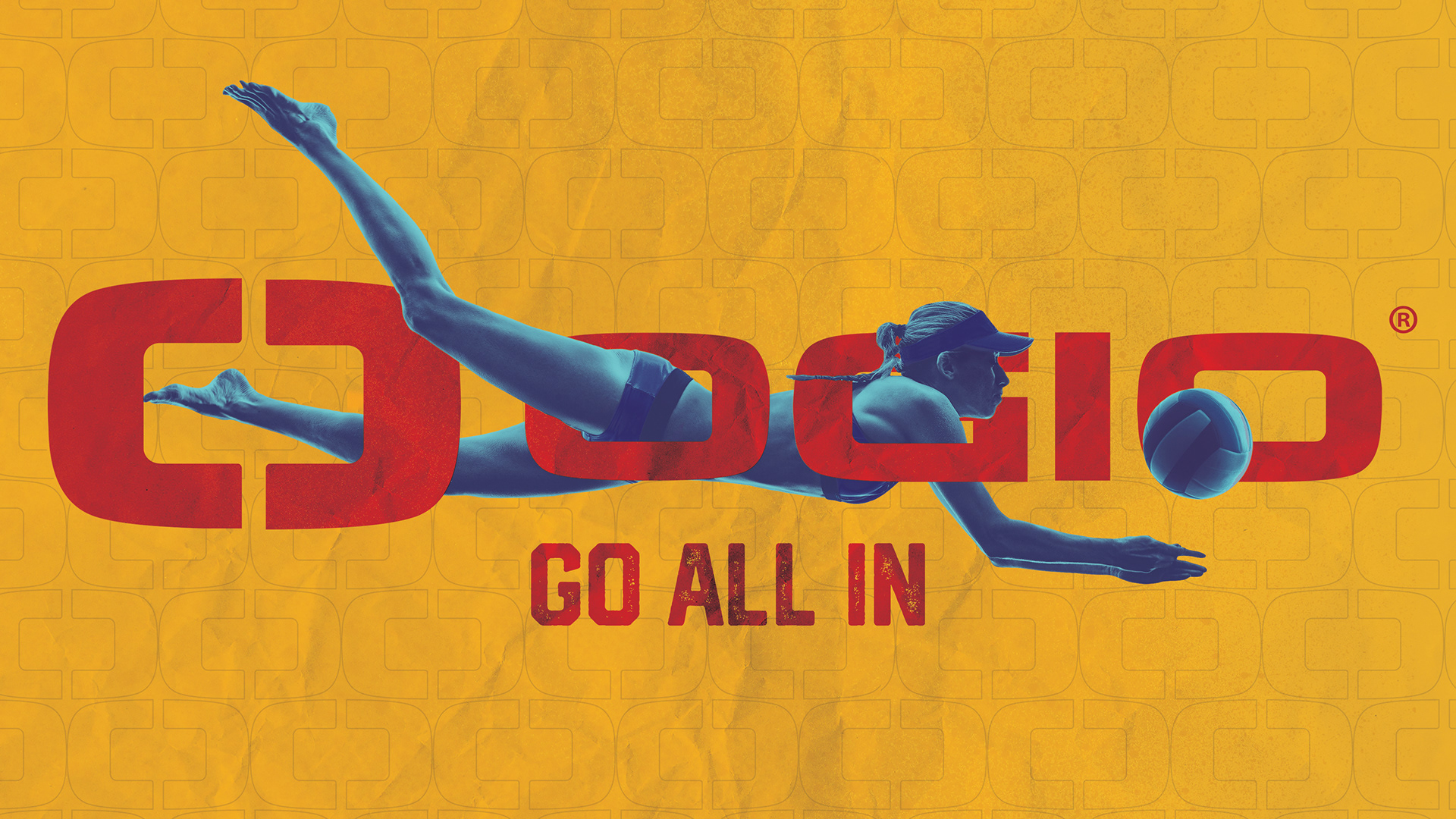
Strong, bold text and color coupled with texture
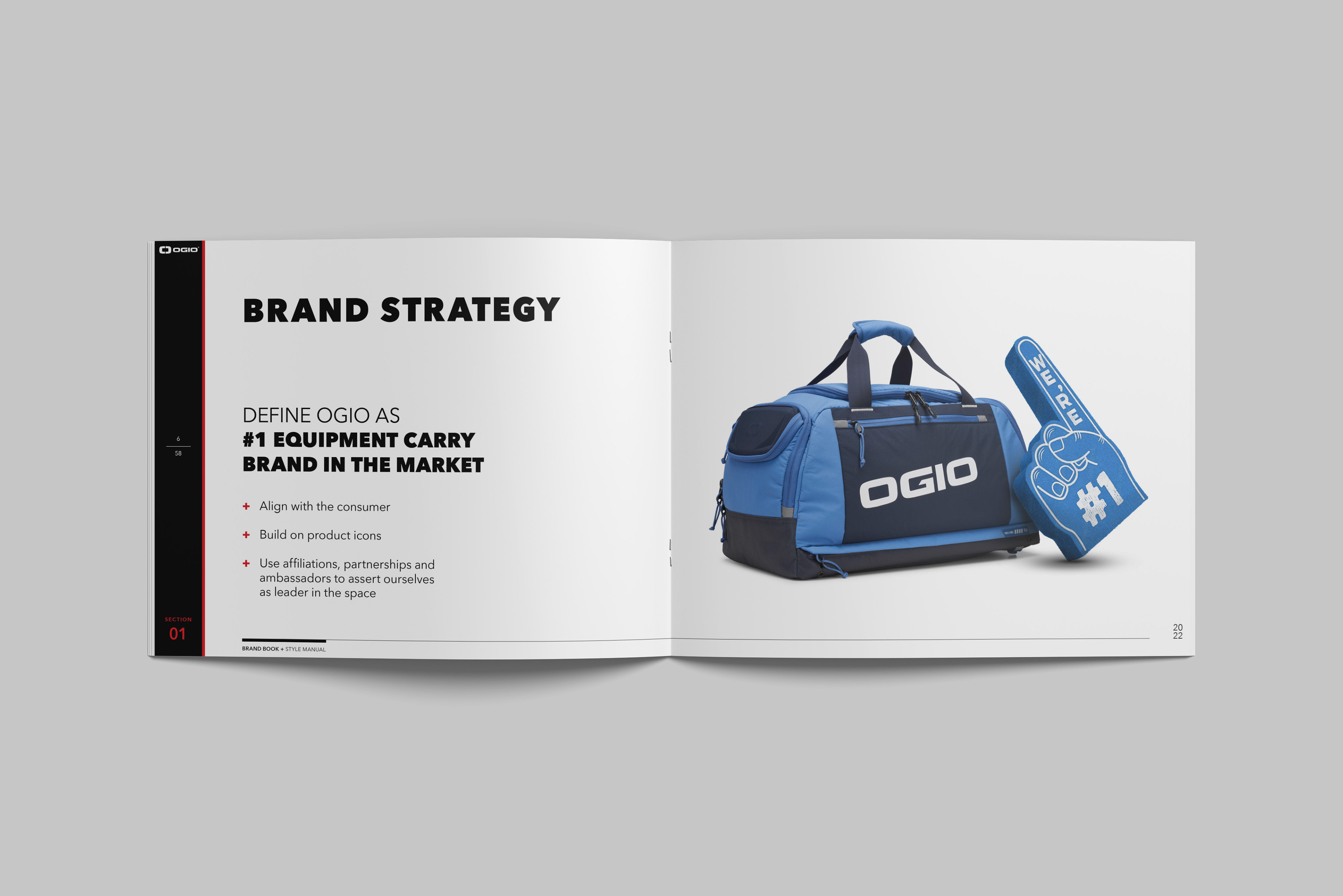
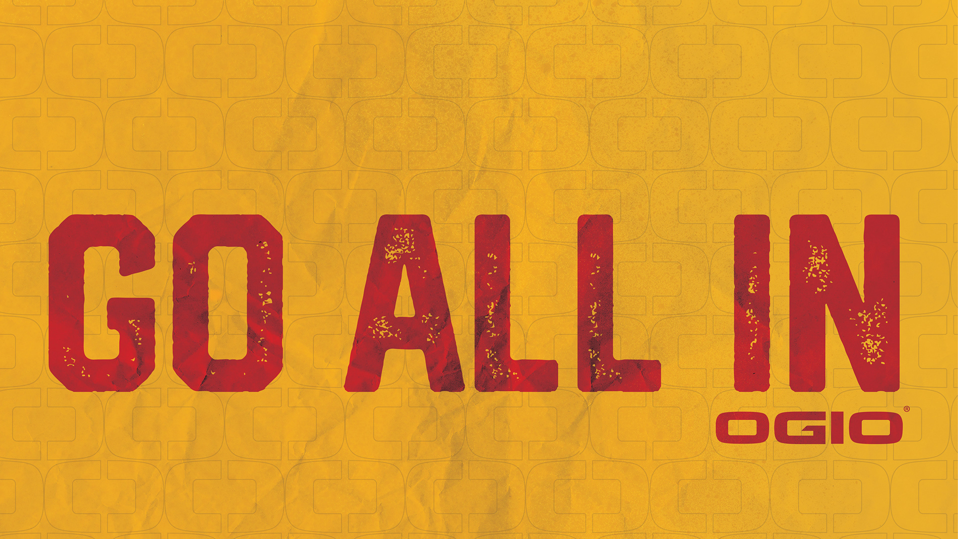
A bit of bravado and goal setting
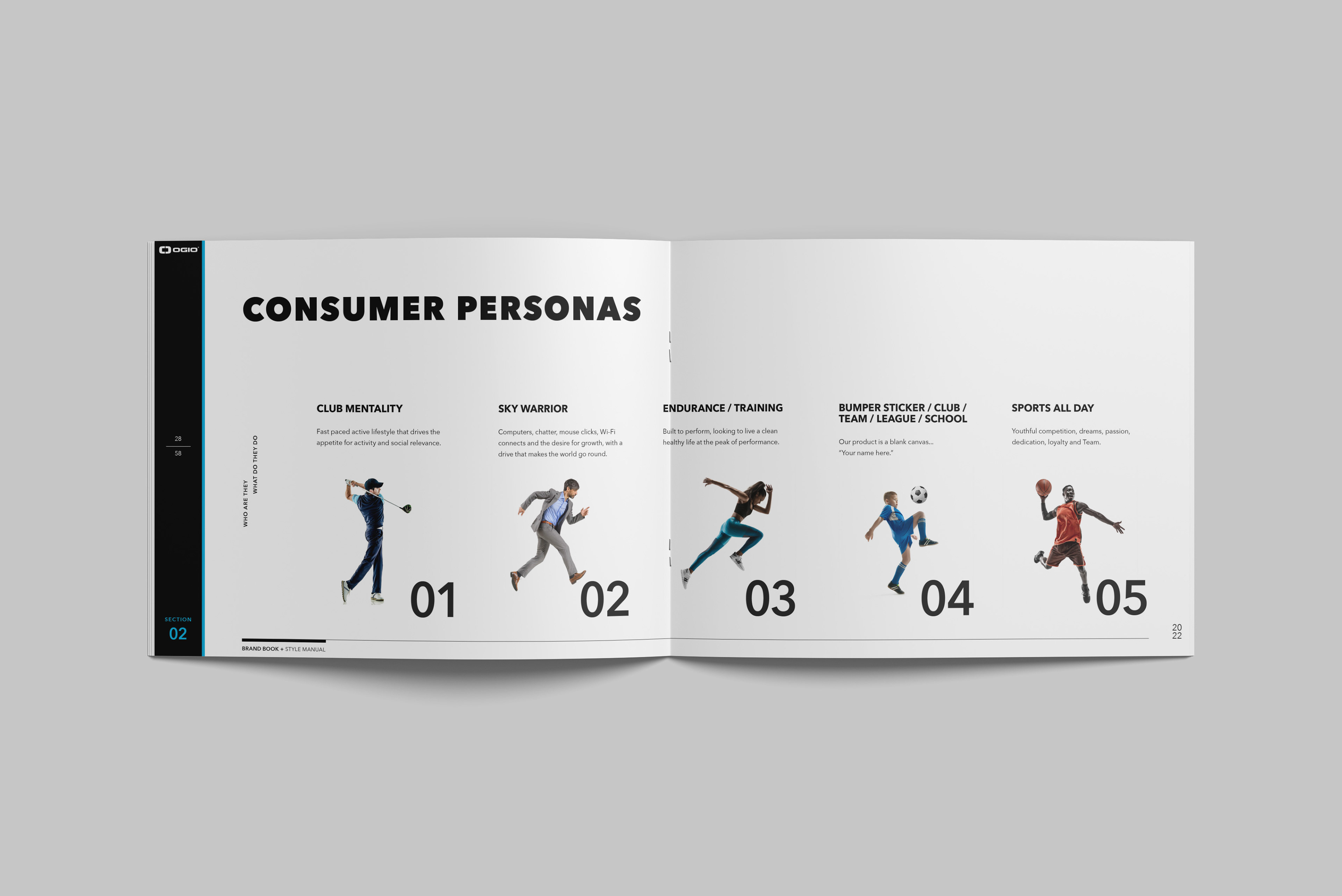
Defining the target market and widening the net
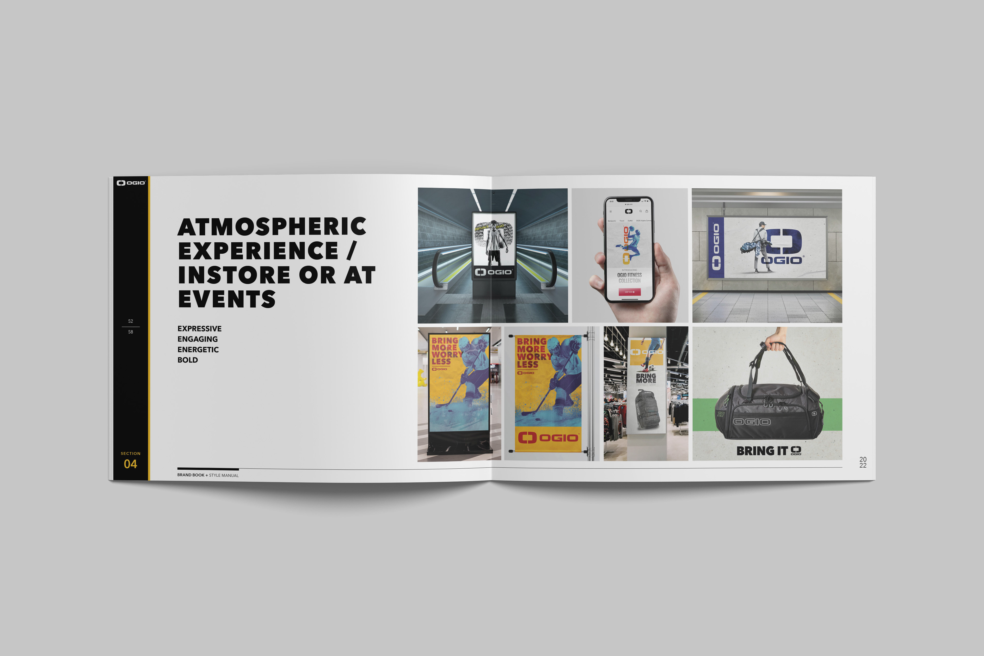
Mockups of visual styles explored in discovery
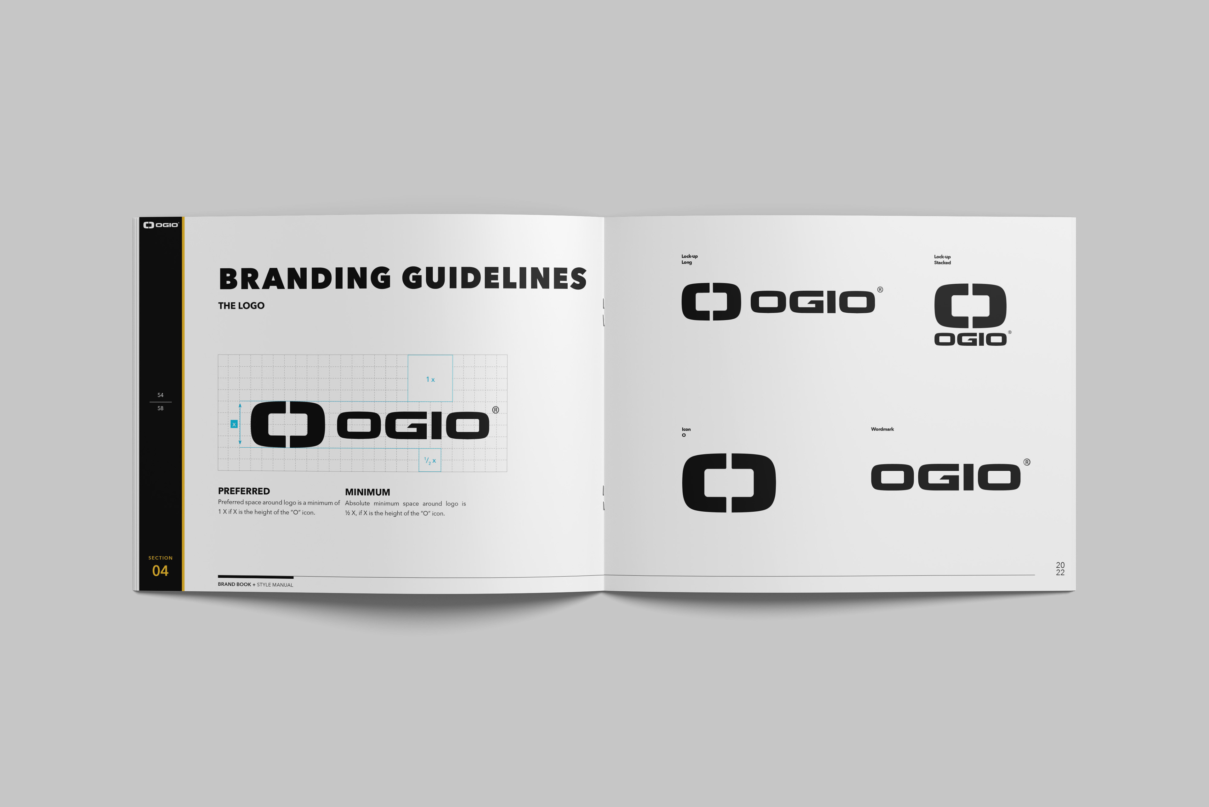
Options for correct logo usage
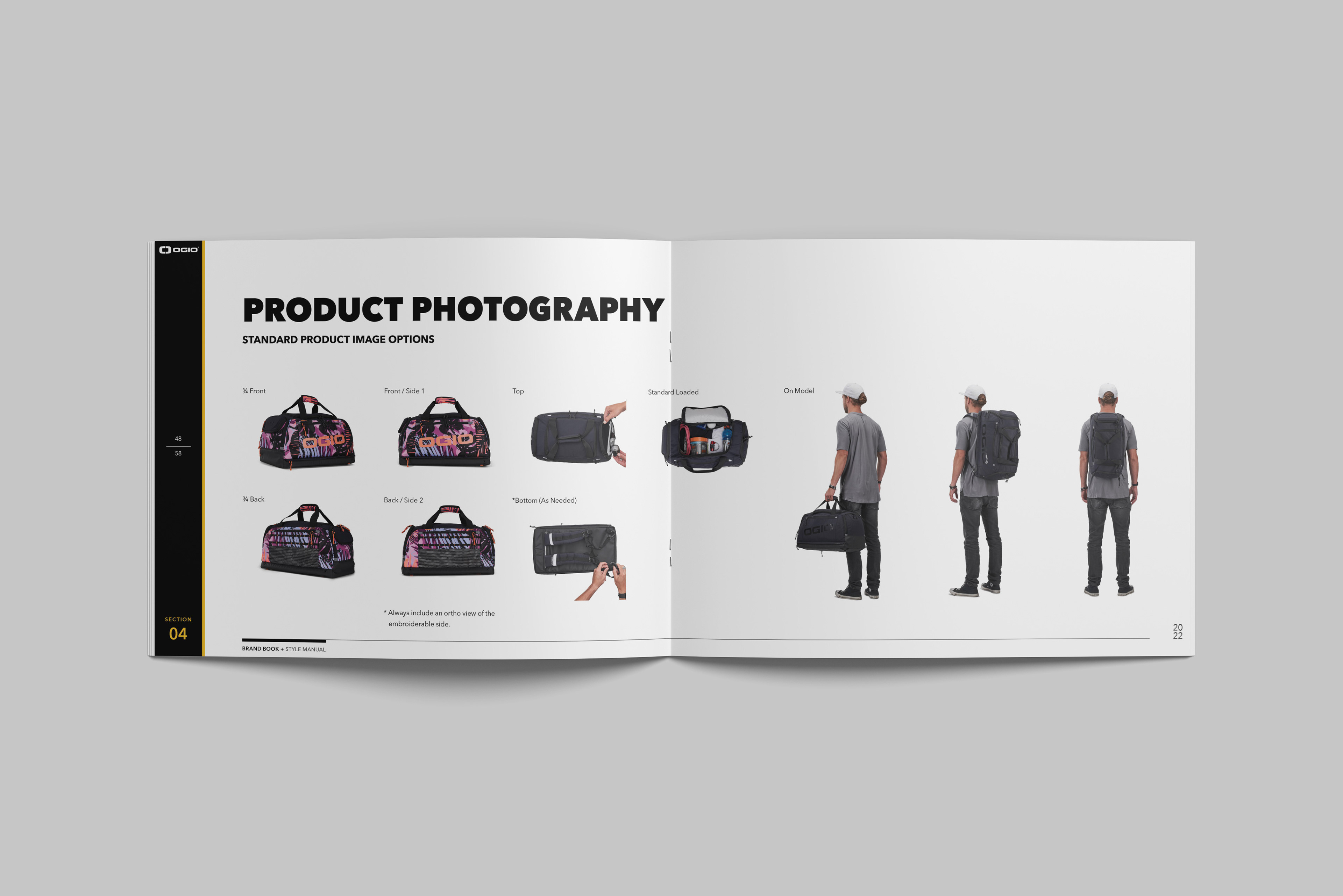
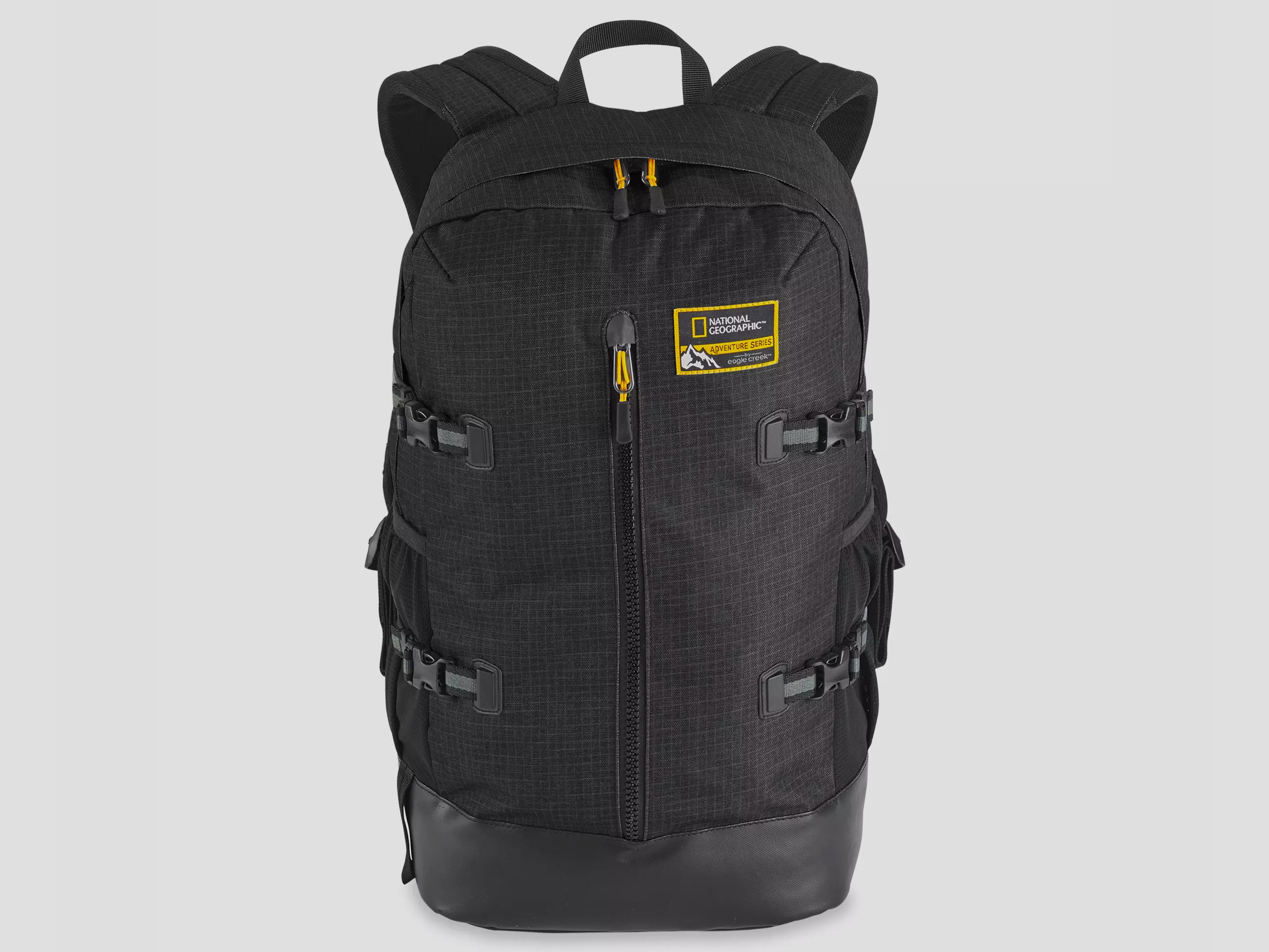
Standard views of product, brings consistency to presentation
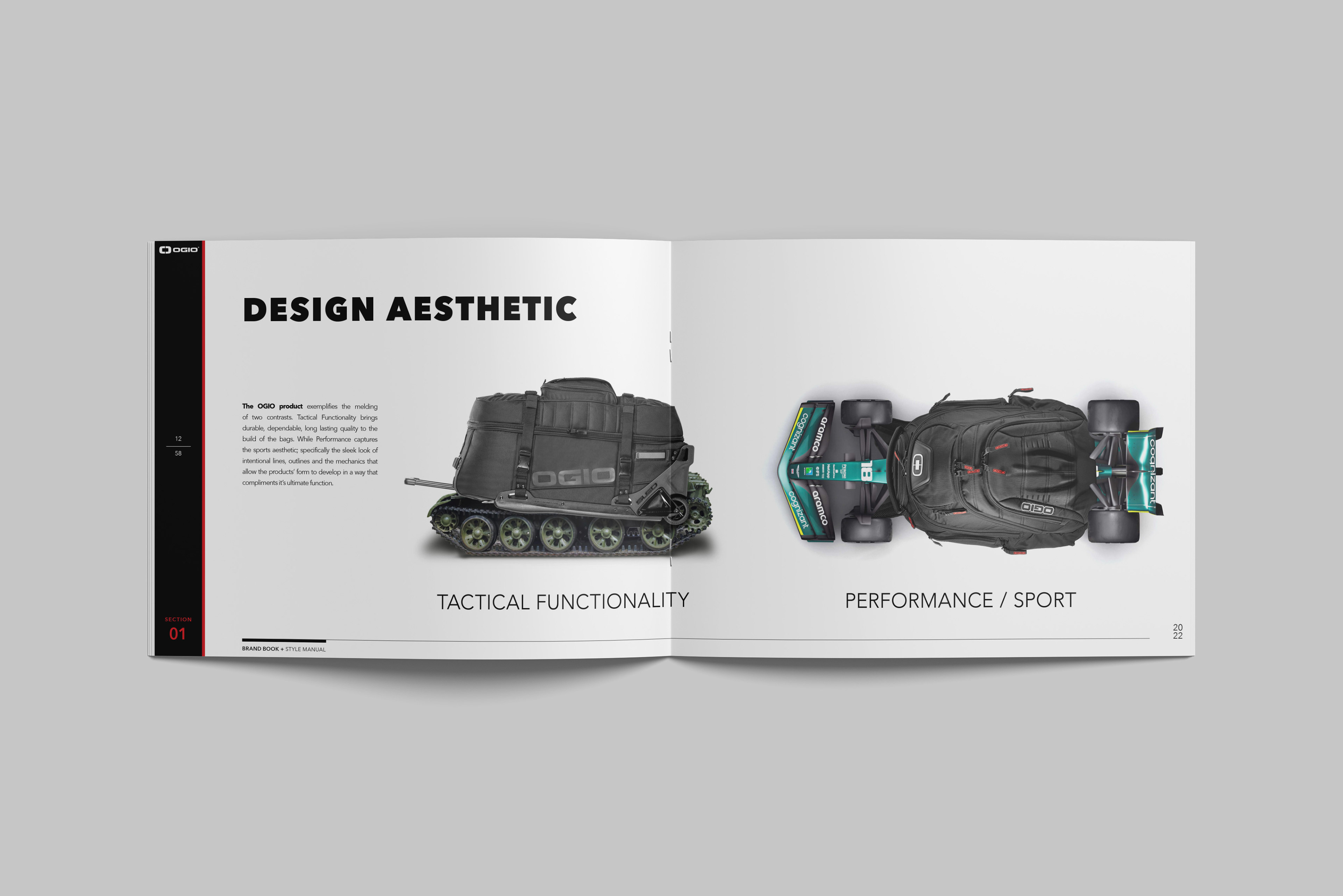
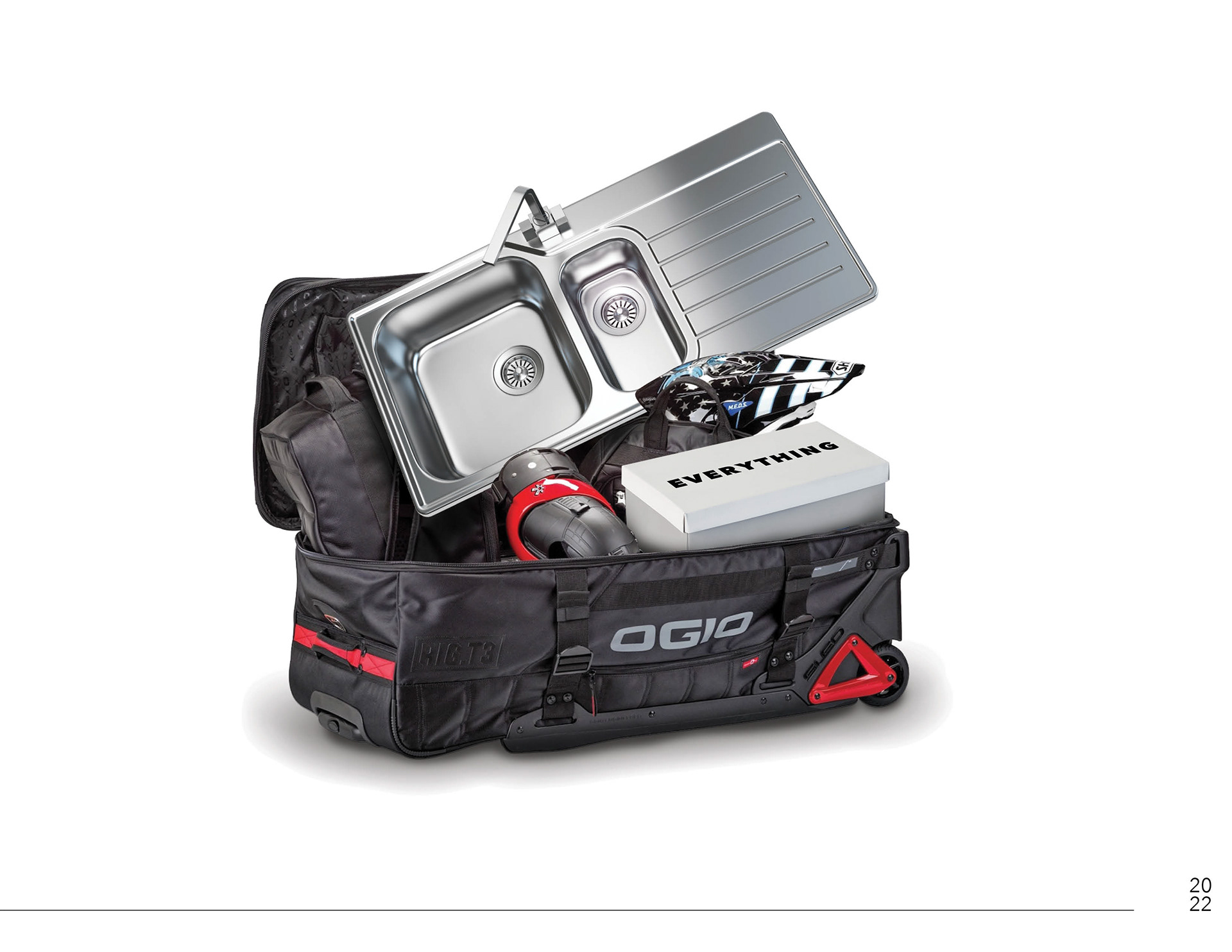
Object MASH-UP representing aesthetic qualities of OGIO bags
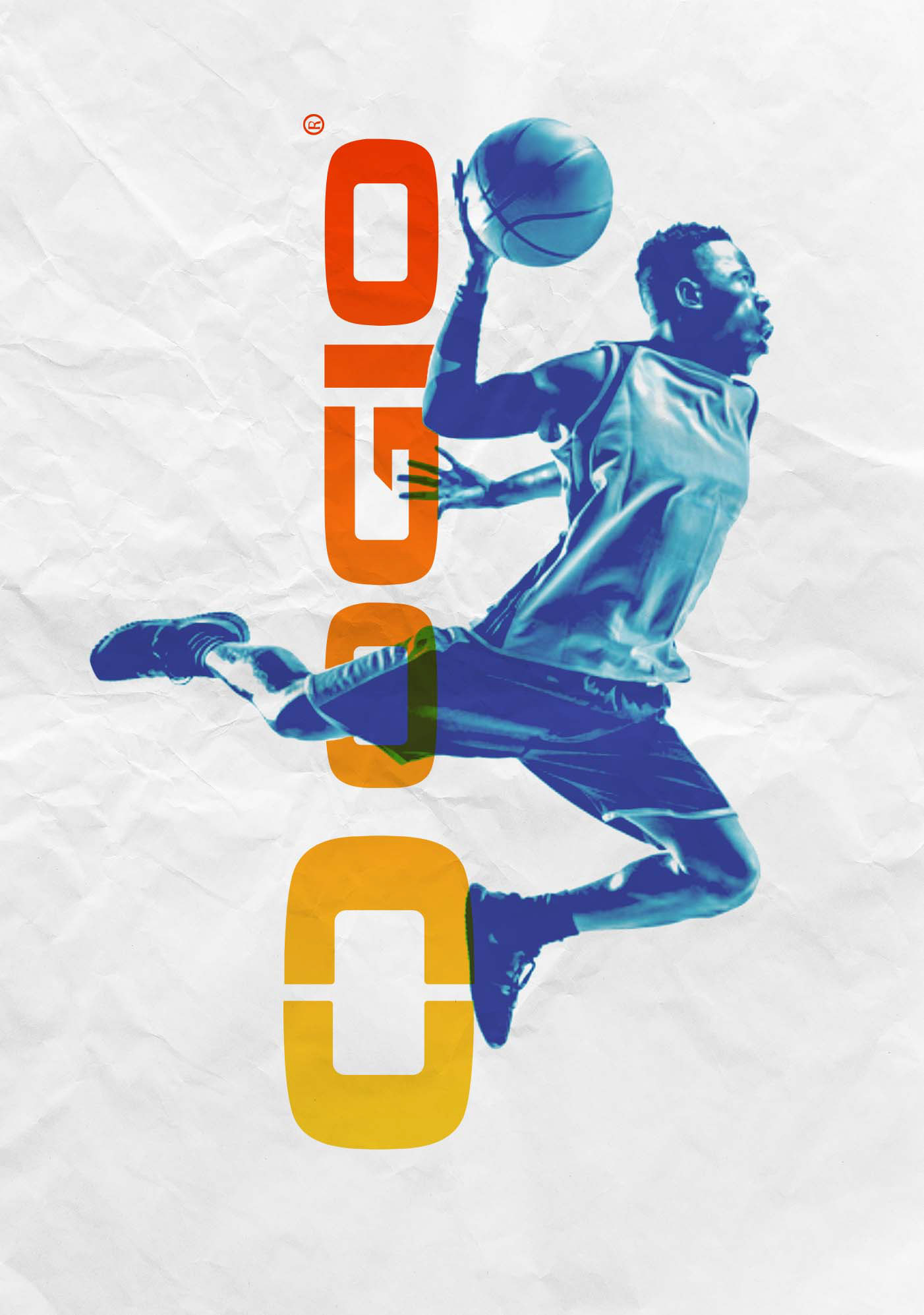
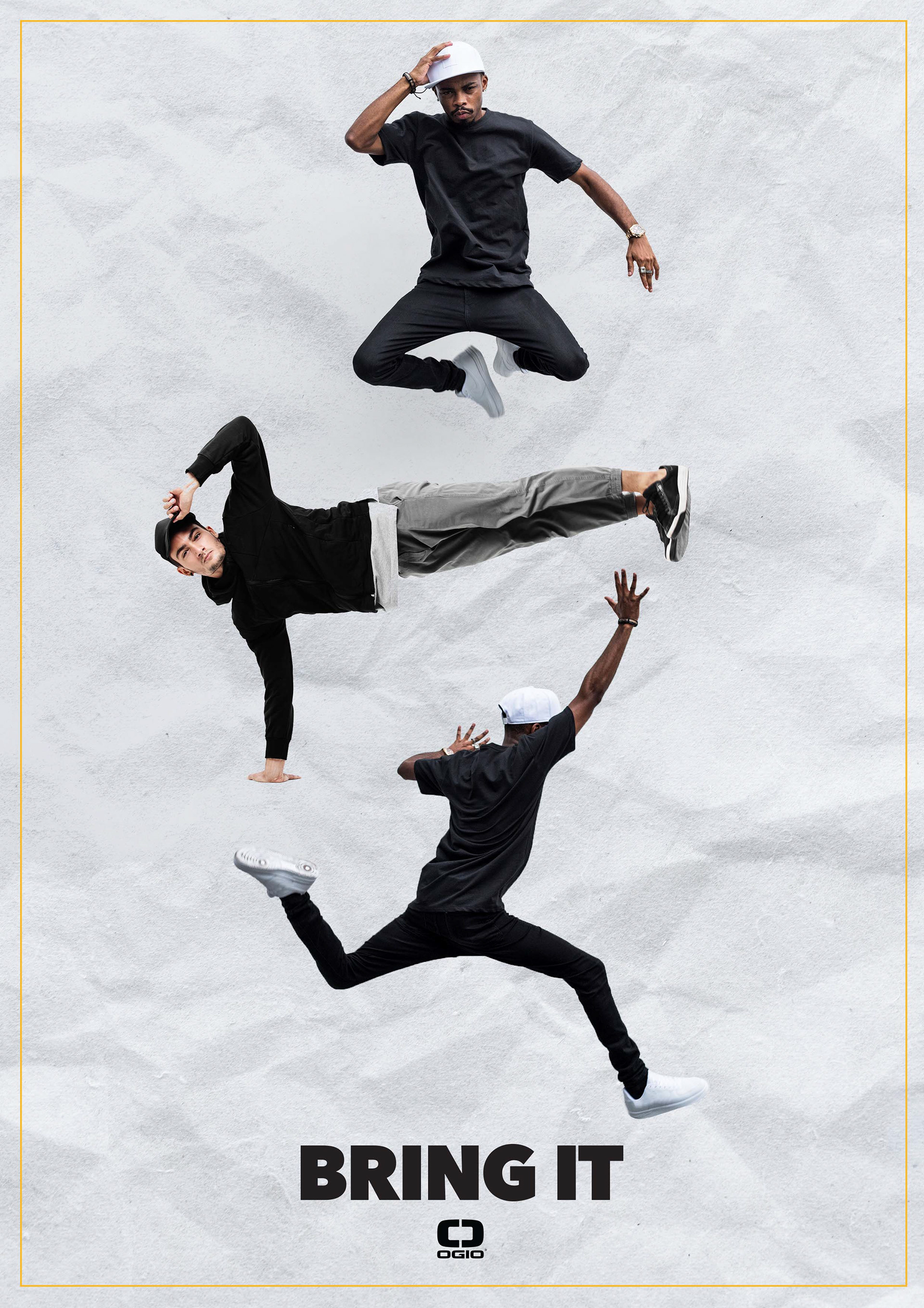
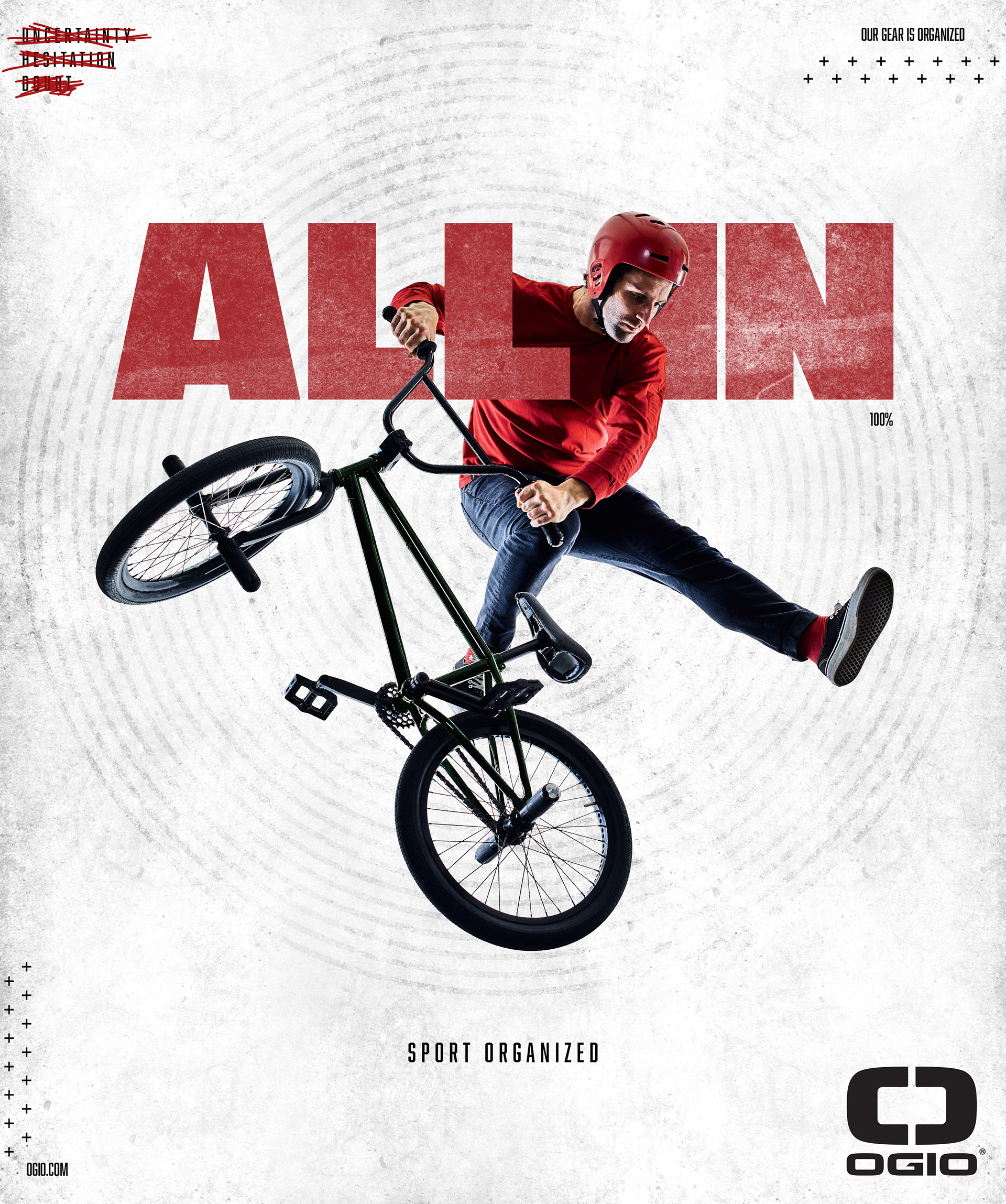
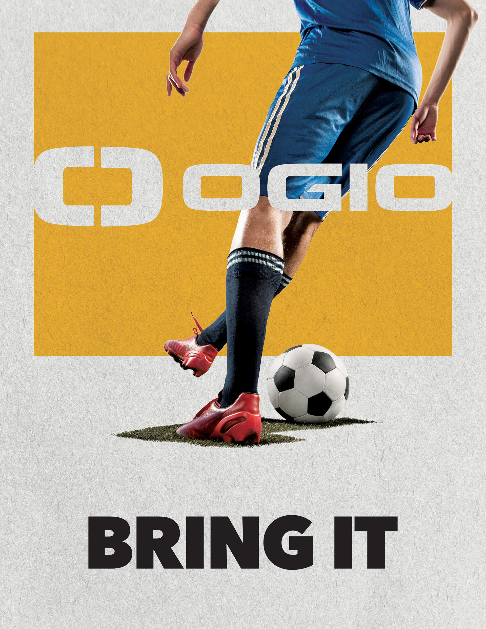
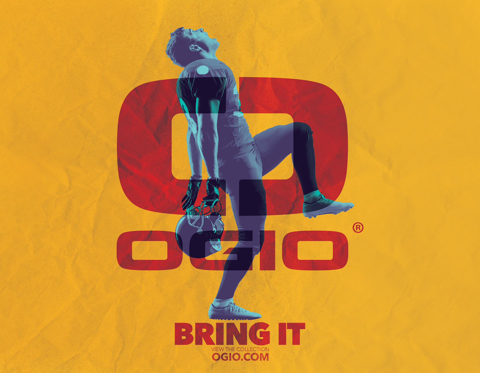
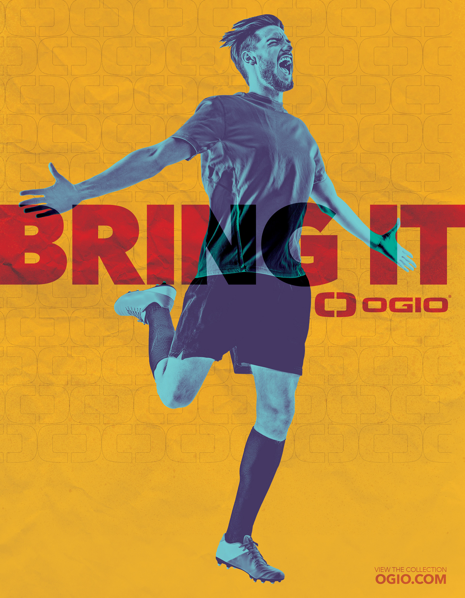
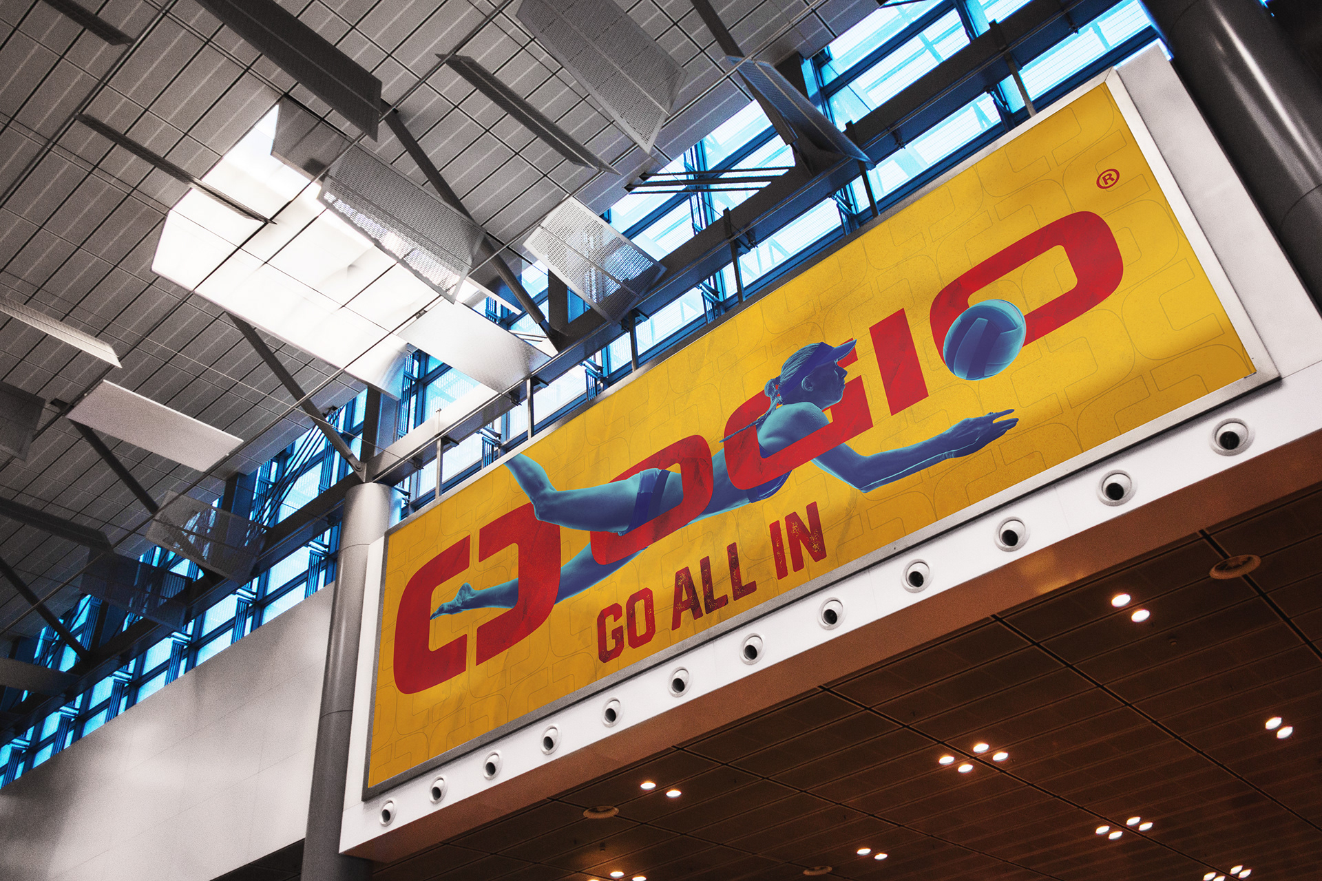
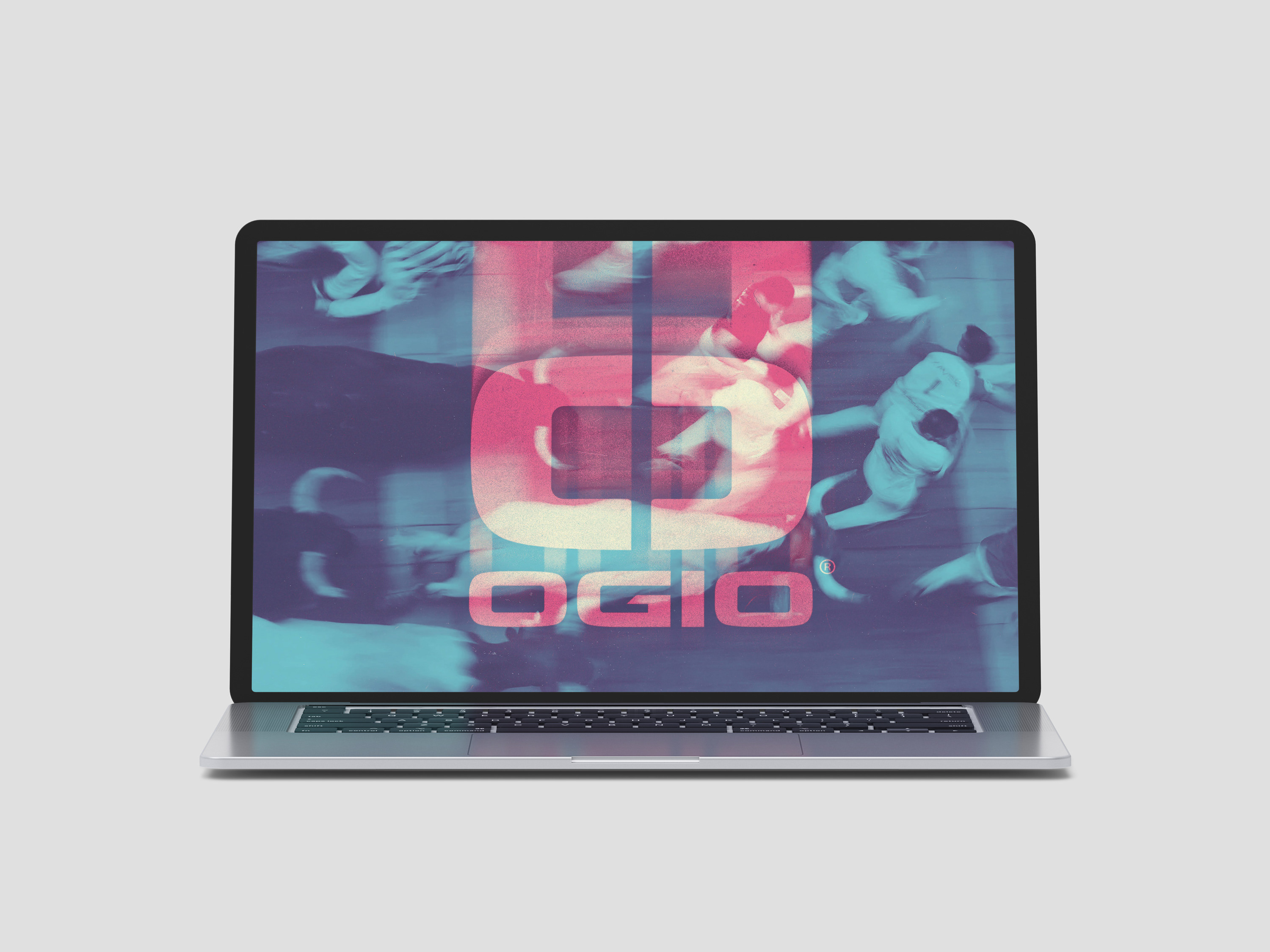
EXPLORATIONS IN STYLE, IMAGE TREATMENT, AND TAGLINE
These are a few of the directions that led to the final look, qualities from each of these designs were collected and combined to create a textured background that utilized bold type, vibrant colors, and showed humans engaged in physical activity. Variations of the tagline morphed into "GO ALL IN" and had a textured type treatment with the athlete being entangled in the words.