PROJECT BRIEF
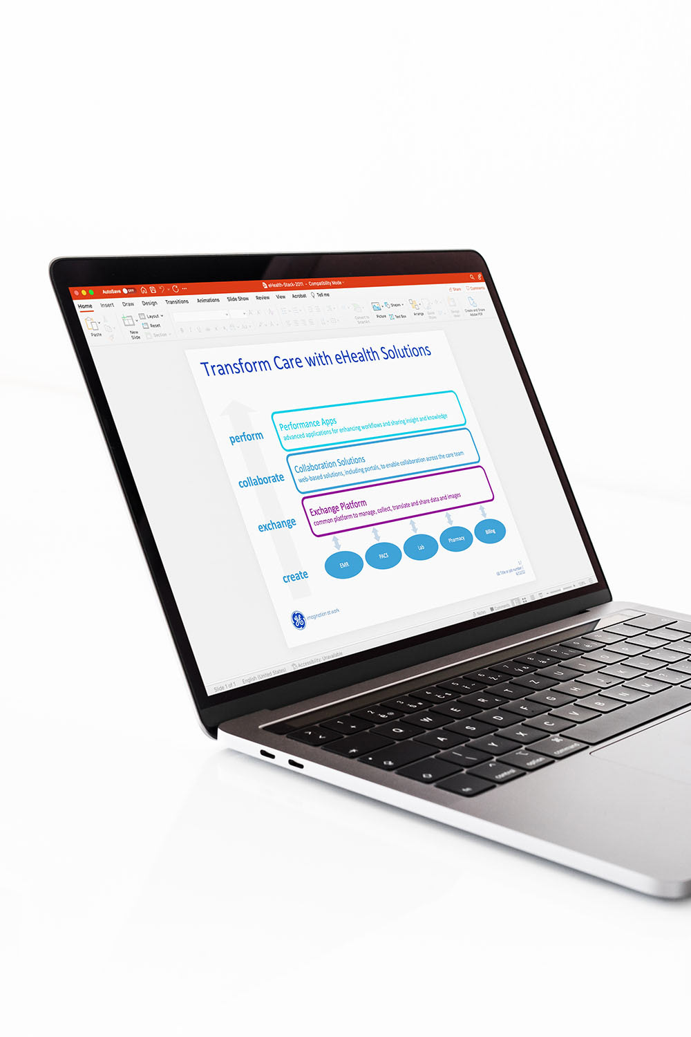
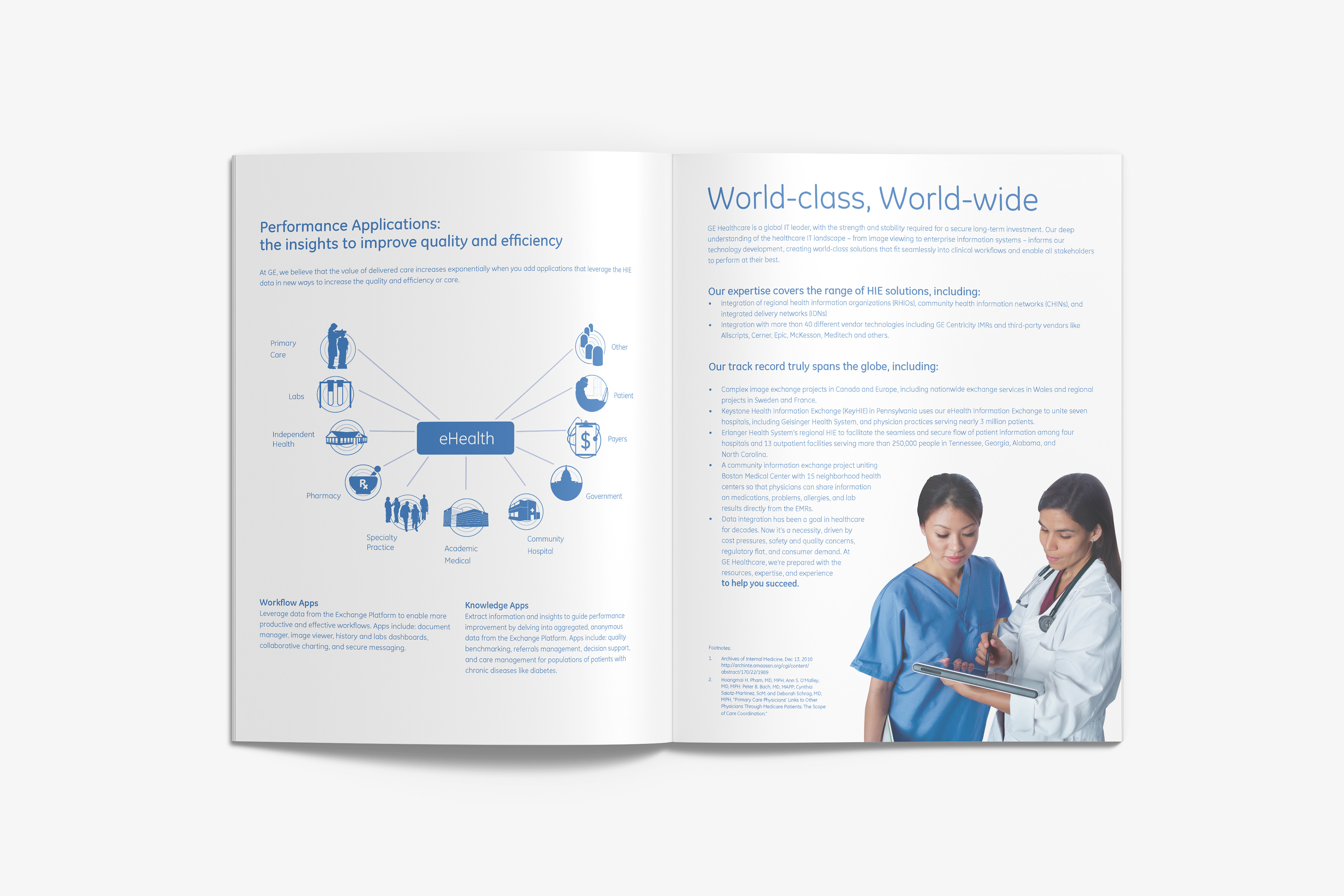
GE had just rolled out a brand new style guide and I was contracted to create the very first sales presentations created for the GE Healthcare eHealth platform under the new corporate visual guidelines. Enroute to a global product launch, the GE marketing team was preparing for the World of Health IT (WoHIT) Conference & Exhibition. While developing content for the presentation, someone realized they also needed quick turn around on supplemental graphics, PowerPoint slide graphics, and layouts for printed marketing materials. The marketing team needed to have various presentation graphics and printed brochures designed with little delay. Working closely with the team we decided which information needed to be included, the order of delivery for the information, appropriate graphics and selected images from the GE asset library. I was responsible for creating a simplified version of the eHealth client portal communication graphic; a diagram (built in powerpoint) that was complicated and full of specific Network and IT data needed to become a clean easy to absorb visual representing the idea that many types of medical professionals can now be connected by a central GE eHealth patient portal.
MY ROLE
Enter the “Gun for Hire,” the freelance designer. Agencies often have too much lag and internal design departments were too over burdened to give a concentrated effort. I was told “this is the first time we’ve tried to use outside vendors and it’s a highly unusual situation for us to reach out to freelancers, but we’ve got to do it and, unfortunately, there’ll be a lot of added pressure because of the current style changes and crazy time crunch.”
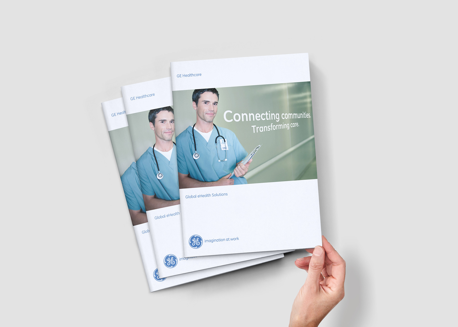
No worries. I worked closely with the team to design the marketing materials they needed, on time and with no margin for error. I also produced the brochure and power point presentation slides the marketing team needed to succeed with the product launch. The brochures needed to be designed, cleared by legal, printed and shipped within a10 day period. Done, done and done.
EXTRA TIDBIT
A short email that illustrates the importance of branding and how the message evolves, as new problems are encountered, you’ll sometimes have to make the decisions that set precedent for later visual communications.
“These guidelines address the need to create ONE look and feel for GE Healthcare AND healthymagination and apply to our communication efforts moving forward. I am sure there will be updates to these guides as we move forward, particularly as new scenarios surface. I’m hoping you can alert me to these, provide your thoughts and ideas – as this is meant to be a team effort. You are the staunch defenders of the GE brand and the most creative members in the business. I am energized by the enthusiasm this has received to date and very much looking forward to seeing how you will take healthymagination to the next level.”
Katherine M. Patterson
Global Marketing Communications Manager
GE Healthcare
Growth Initiatives
Global Marketing Communications Manager
GE Healthcare
Growth Initiatives
PowerPoint presentations needed to be rebuilt to reflect the new brand standards, better organize information, include quality graphics that represent the concepts presented and tidy up the inconsistencies.
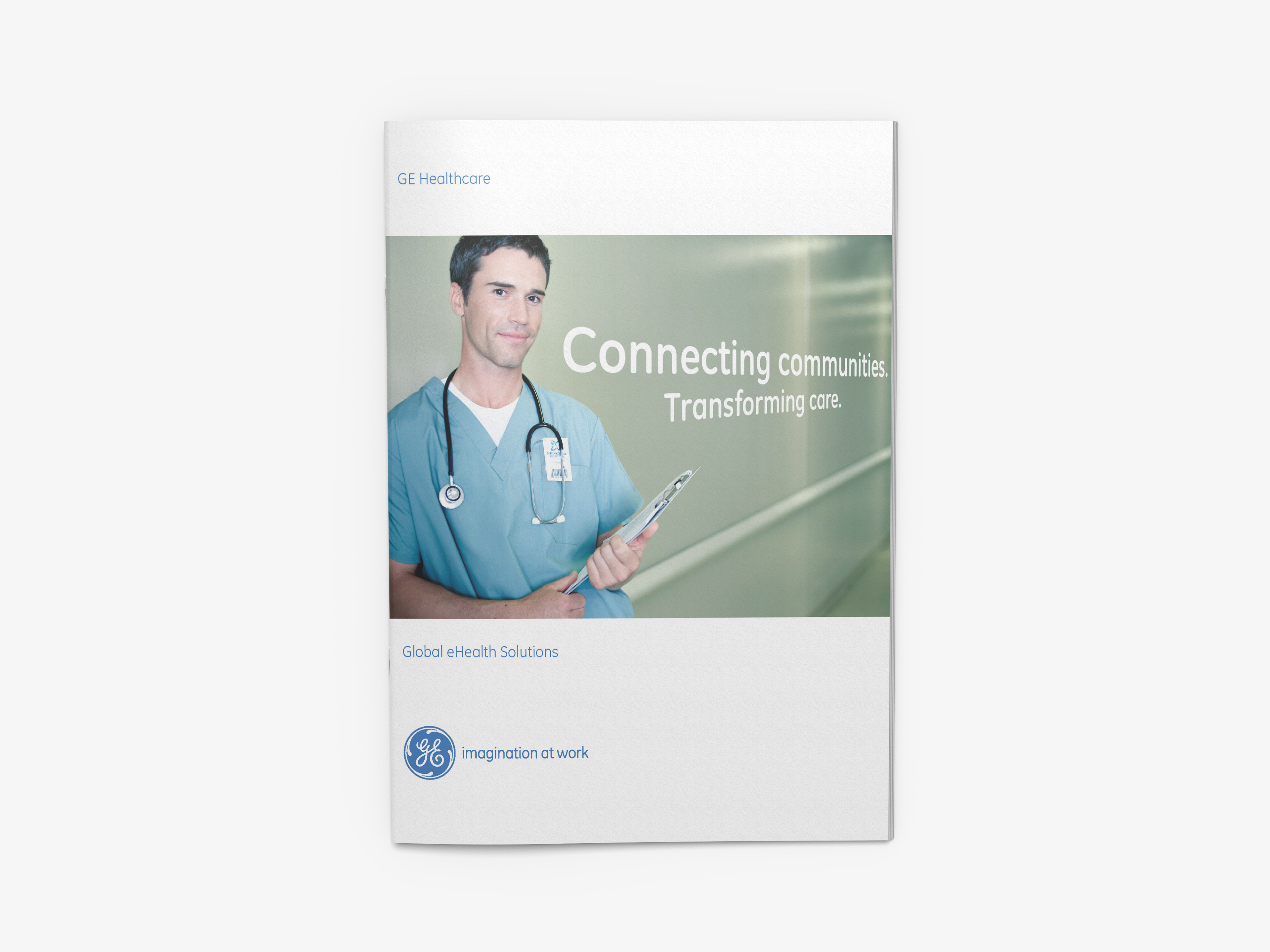
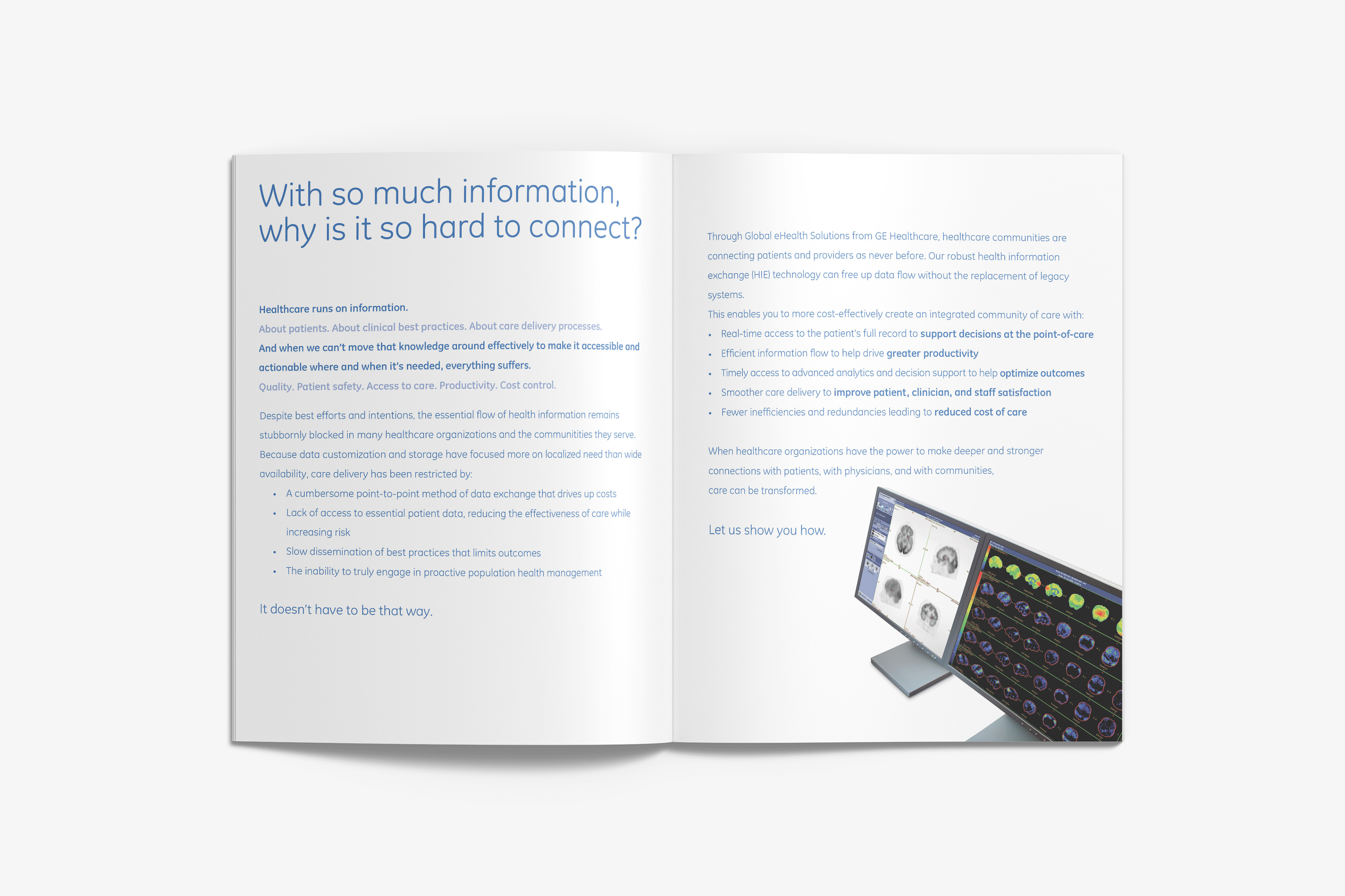
Cover has brand standard placement and size of elements
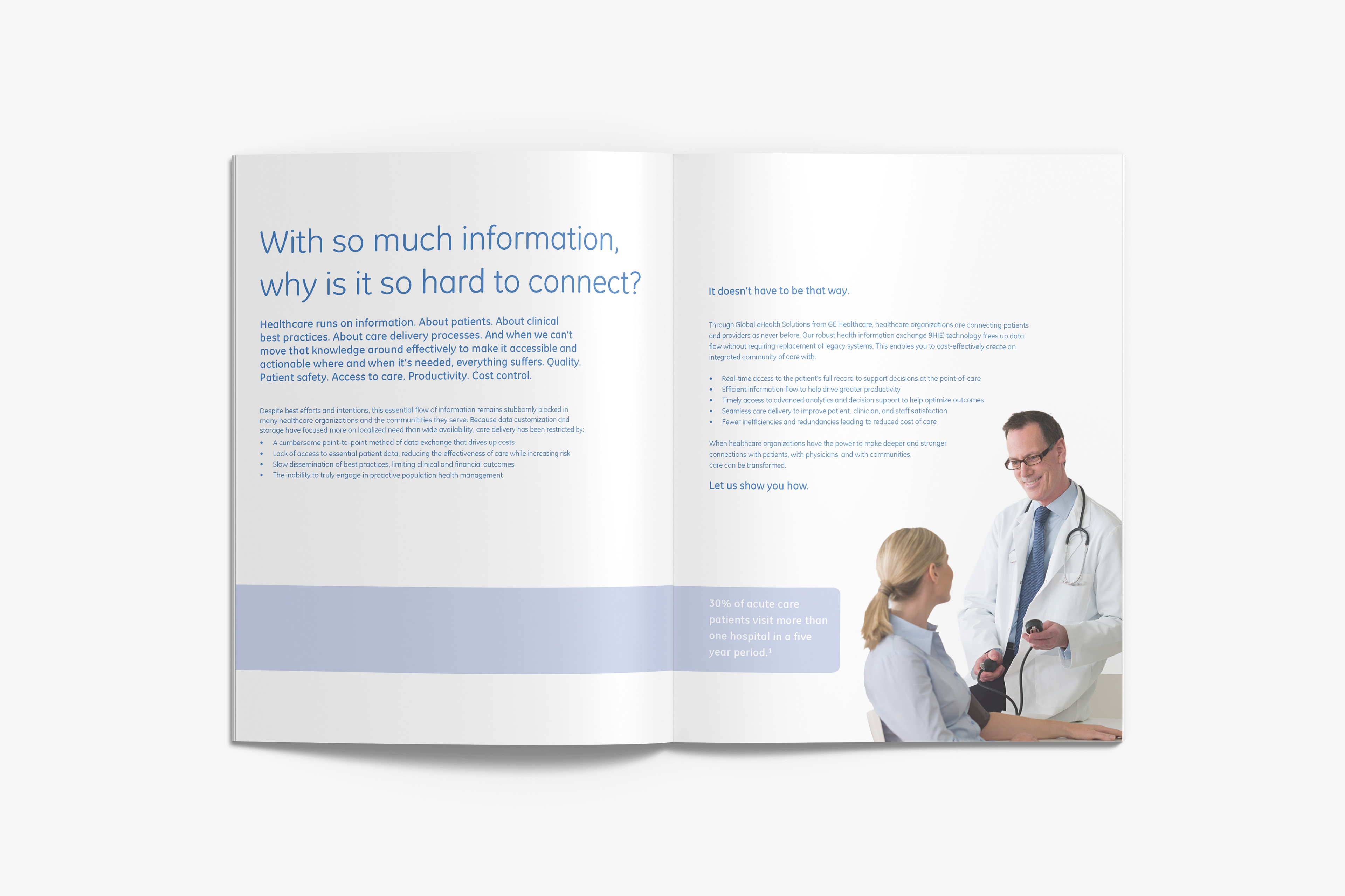
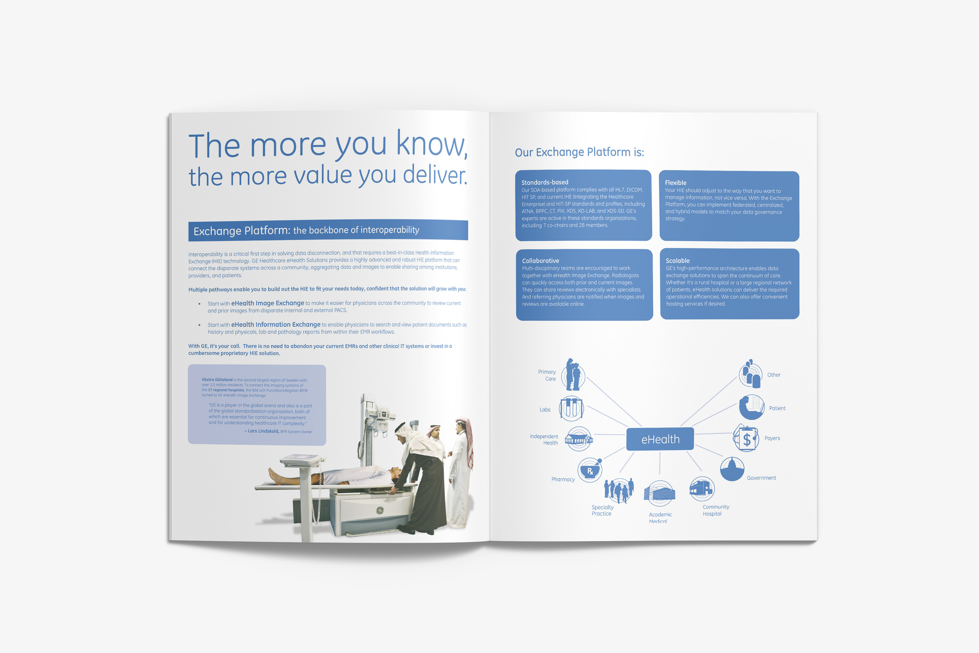
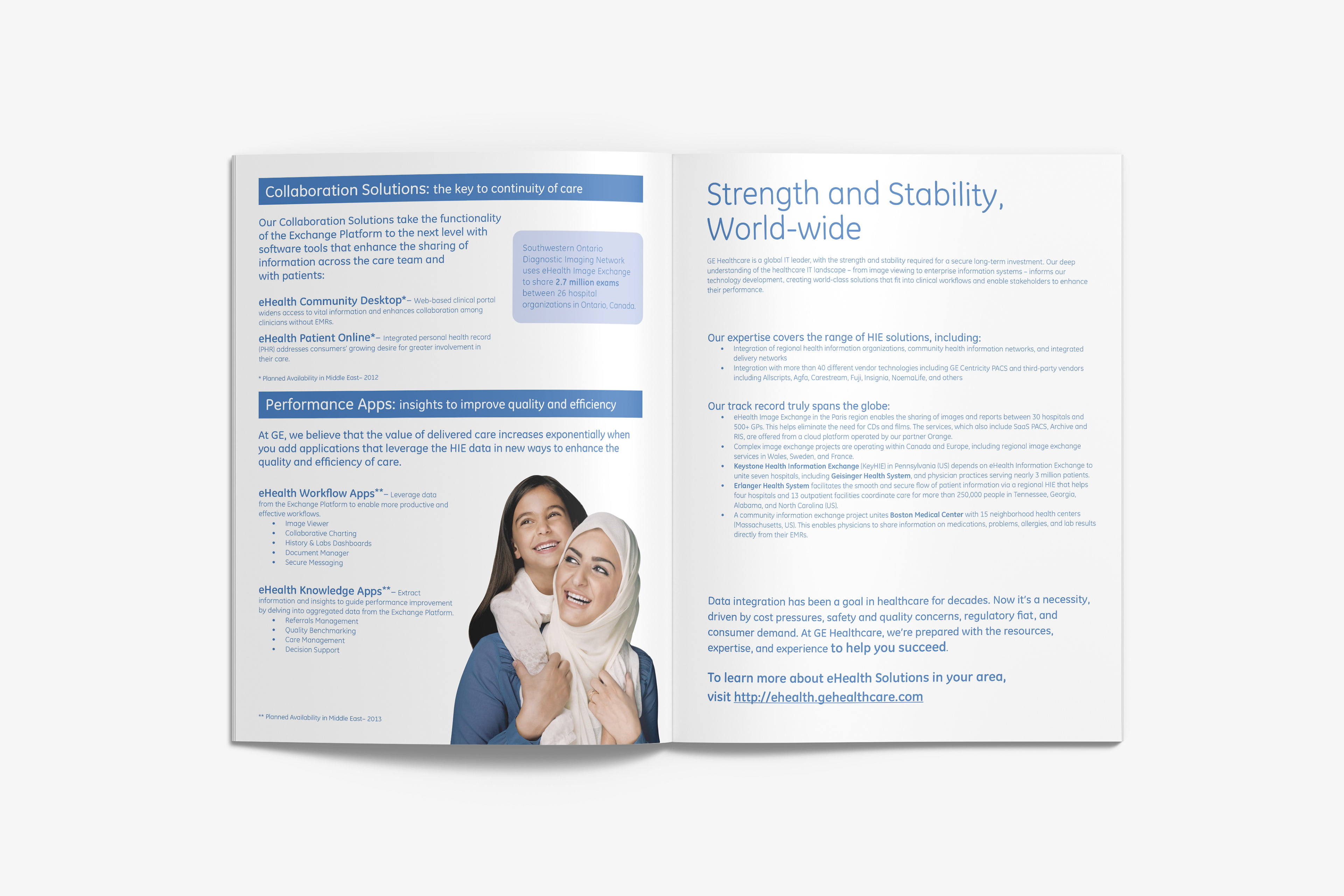
Page layout has plenty of whitespace and breathing room
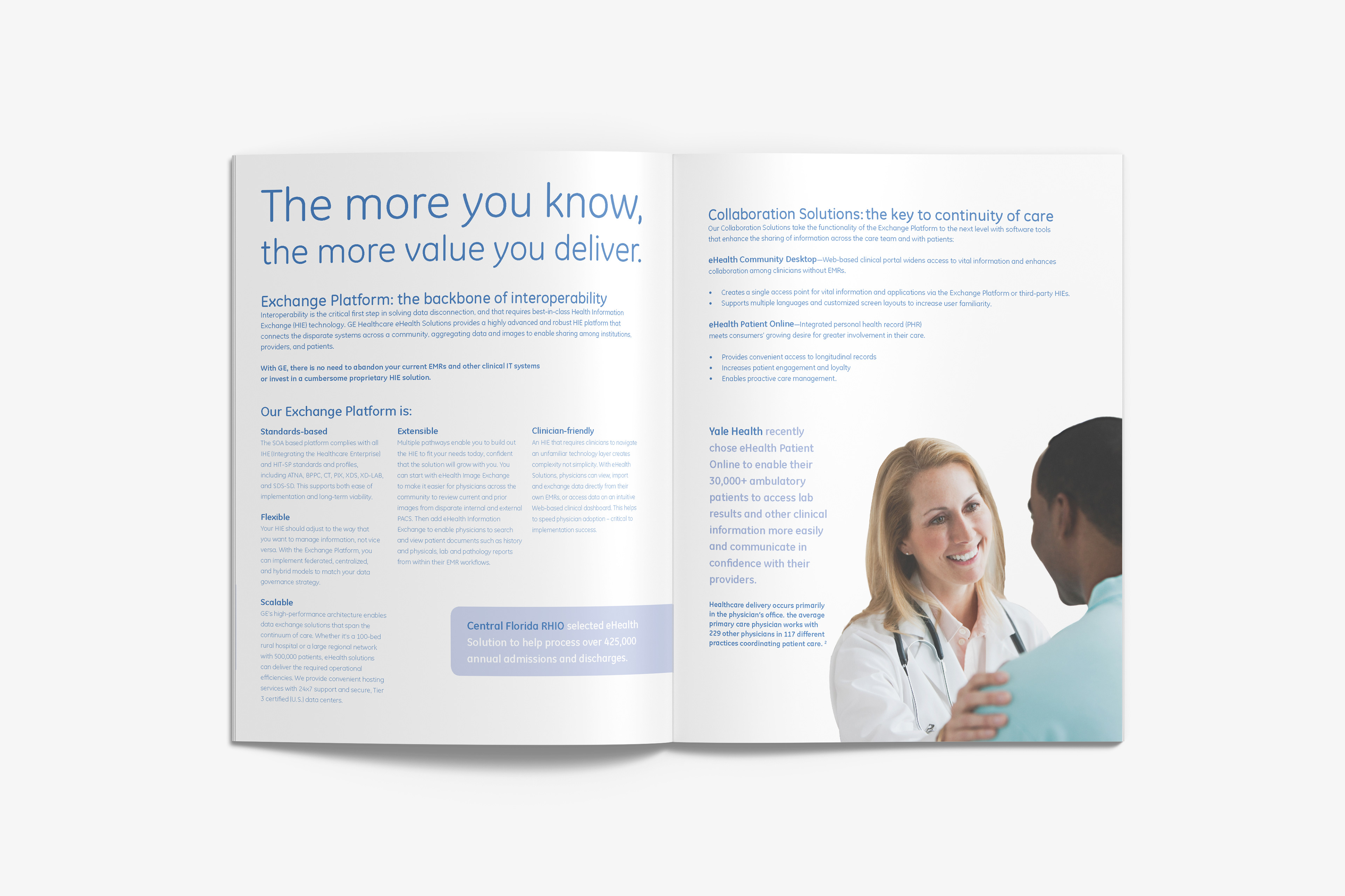
Dense content relies on information hierarchy to allow for easy digestion of info
Models are cutout and placed over solid white
Middle Eastern brochure pages include alternative content set in GE Inspira font
Regionally appropriate models and information for Middle East version
Brand color options are restricted to Pantone and tint percentages
Clean and organized typography using color to create sections of information
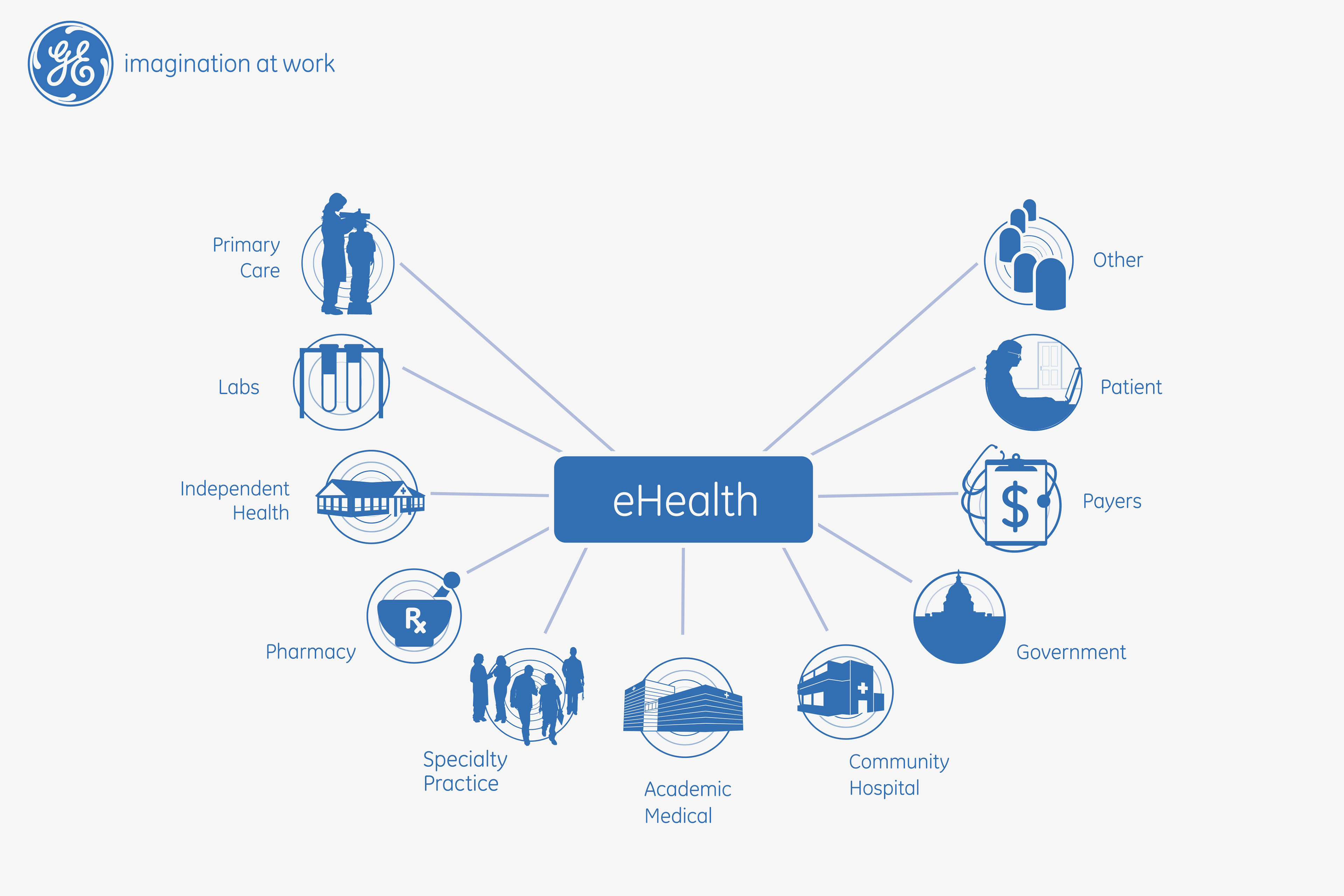
Custom illustration visually showing the interconnectivity of all users of the GE eHealth Patient Connect system
EXTRA TIDBIT
A short email that illustrates the importance of branding and how the message evolves, as new problems are encountered, you’ll sometimes have to make the decisions that set precedent for later visual communications.
“These guidelines address the need to create ONE look and feel for GE Healthcare AND healthymagination and apply to our communication efforts moving forward. I am sure there will be updates to these guides as we move forward, particularly as new scenarios surface. I’m hoping you can alert me to these, provide your thoughts and ideas – as this is meant to be a team effort. You are the staunch defenders of the GE brand and the most creative members in the business. I am energized by the enthusiasm this has received to date and very much looking forward to seeing how you will take healthymagination to the next level.”
Katherine M. Patterson
Global Marketing Communications Manager
GE Healthcare
Growth Initiatives
Global Marketing Communications Manager
GE Healthcare
Growth Initiatives