Project brief
The Island Prep Preschool brand was expanding to more locations and needed a visual distinction between locations. Separate logo marks were created for each of the new ventures including: Island prep Elementary, Bayside Preschool, and Aspen Prep Preschool. The school also needed an updated corporate website with payment and application sign up capabilities; marketing material, such as graphics for school merch; "real" imagery of the actual school classrooms to show the children’s daily routines and program offerings; development of the brand voice and messaging through strategy consultation.
THE IDENTITY
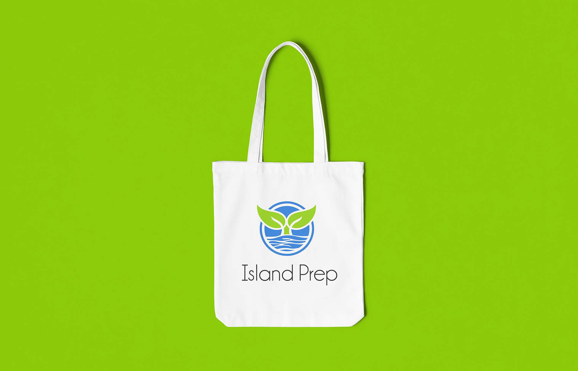
In order to distinguish the elementary school from the preschool the brand needed more than a separation by color (previously the preschool was a green whale and the elementary was a blue whale) so I suggested a different icon be developed. After a few rounds I came up with the idea of a whale tail which looked like two sprouting leaves, representing the "growth of the students." This way I could merge the green and blue from the two schools, keep with the whale theme, but show the students entering new waters. The badge made an identifiable icon, which works great as a two color or one color version and is versatile so it can be reproduced easily.
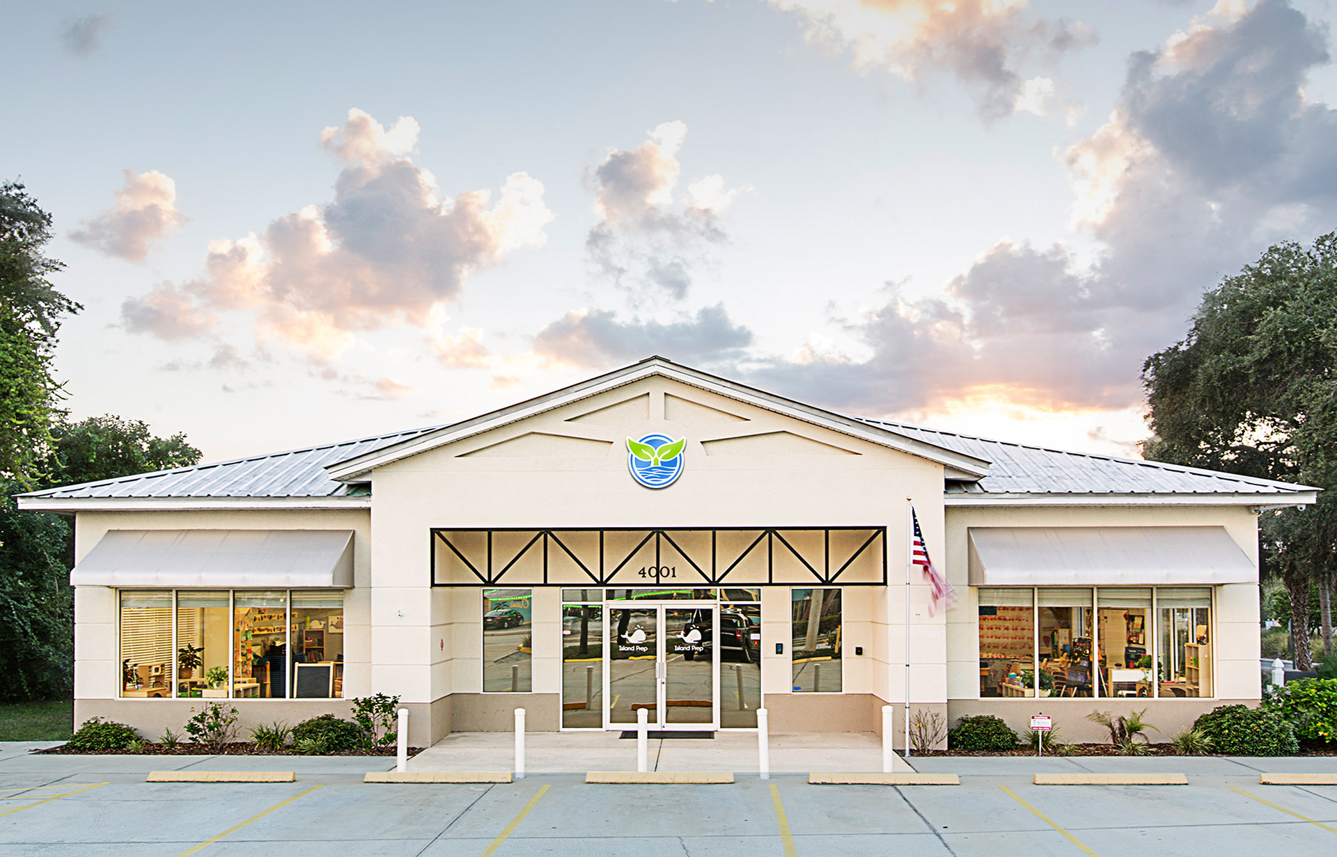
Hero image architectual photography
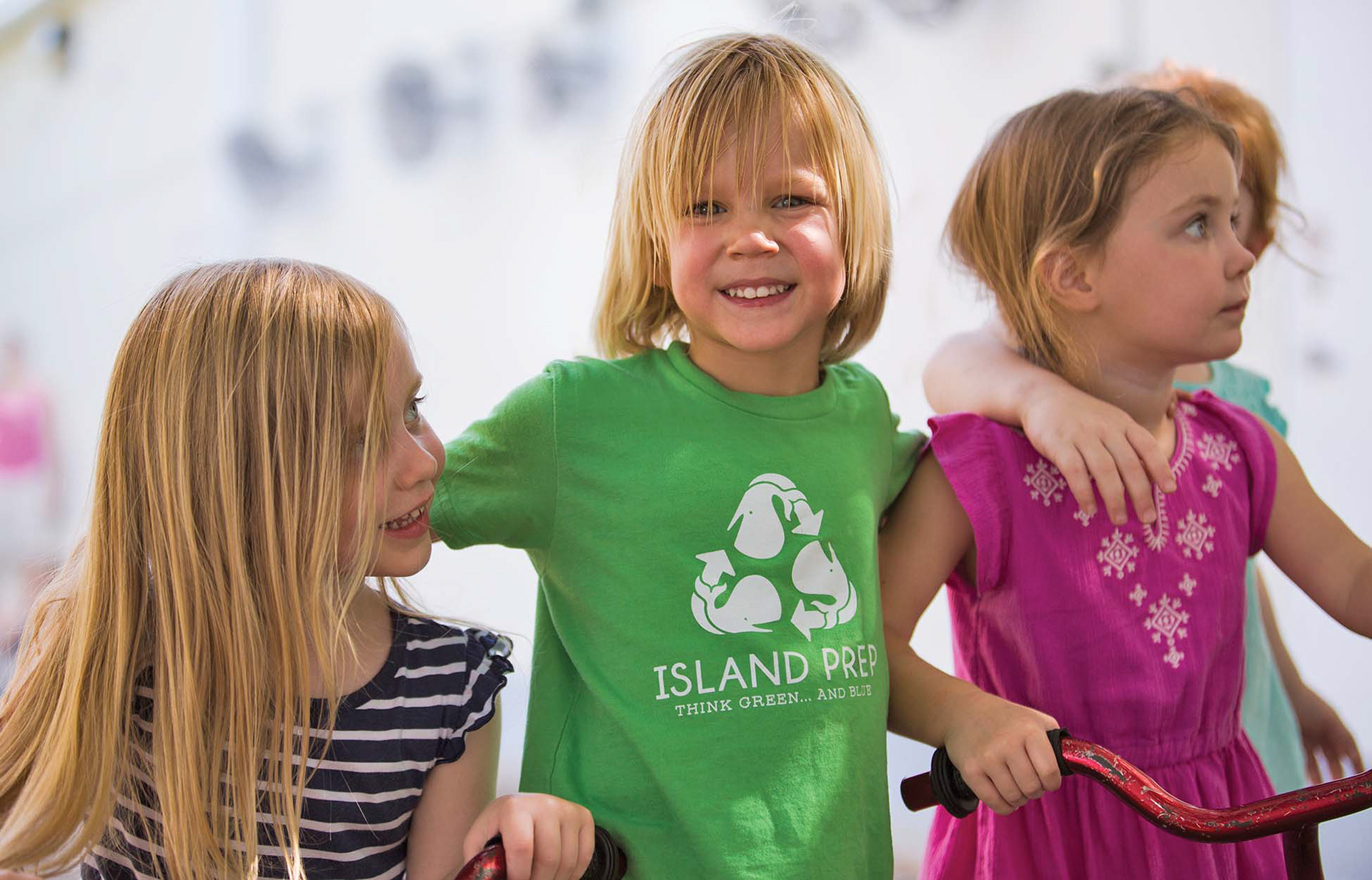
Hero image students

Hero image administration
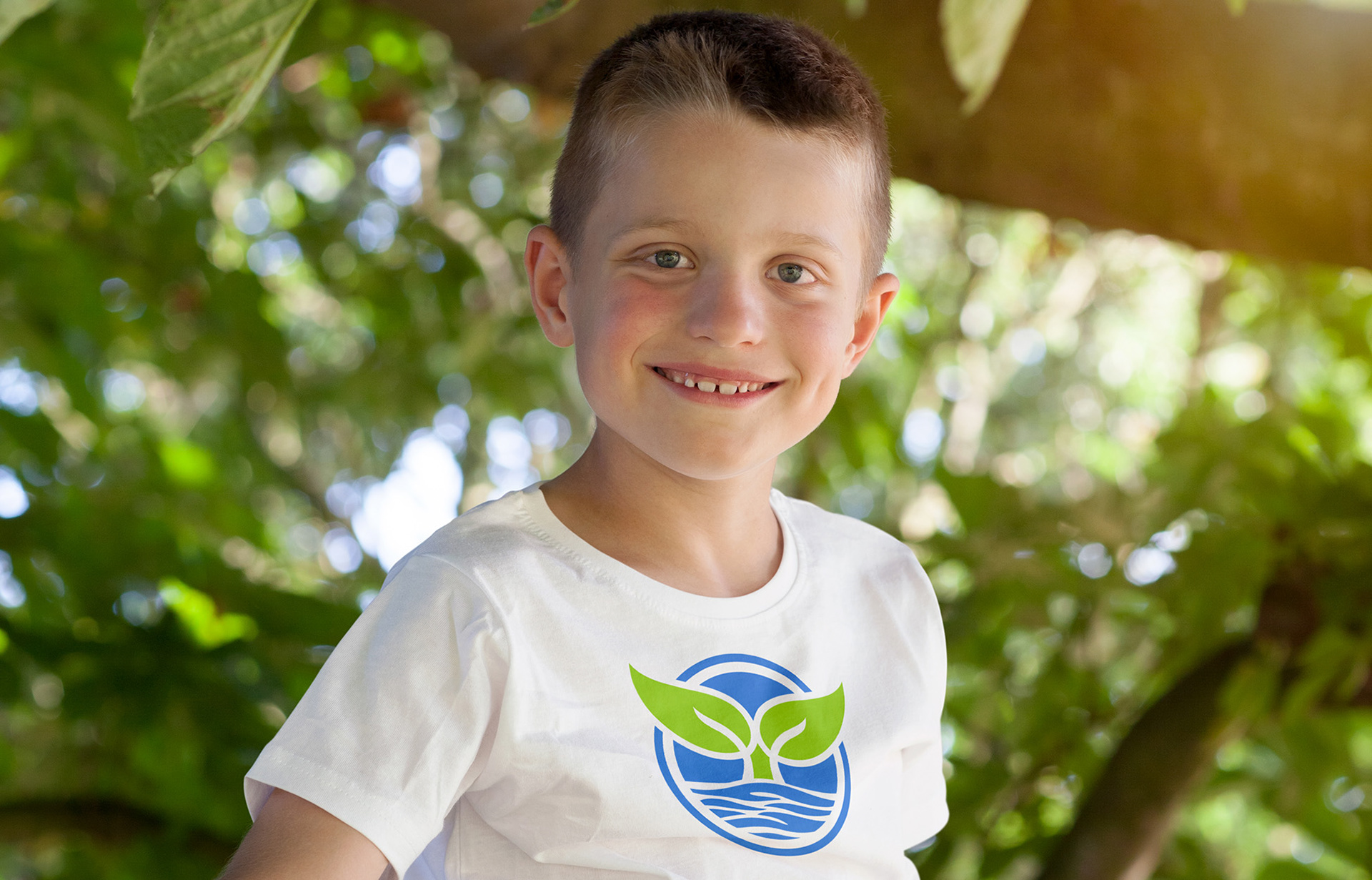
School merch design - t-shirt graphic

School merch design - graphic tee

School merch design hero image

School merch lay down presentation
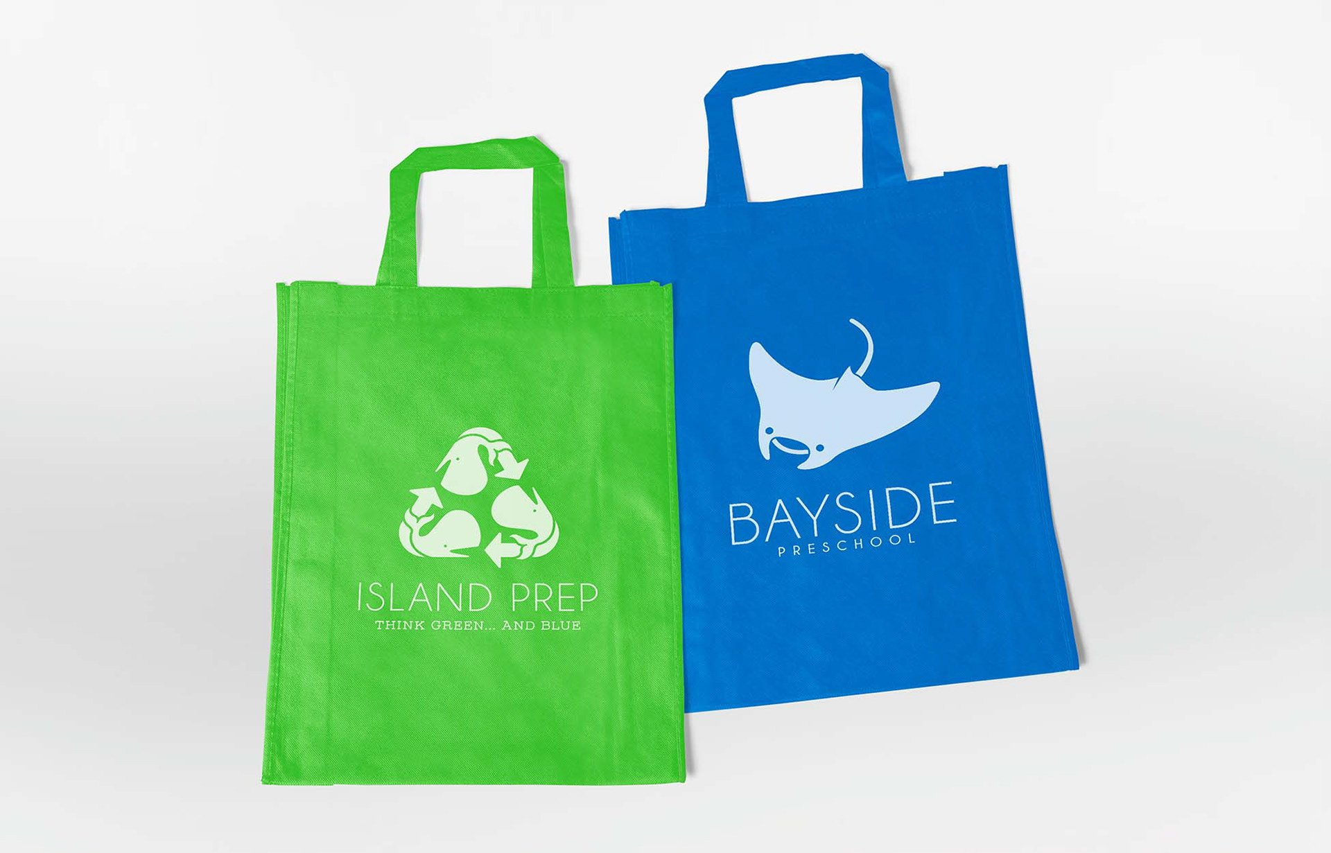
school merch - bags made from recycled material

Tagline coming from the two schools are affectionately referred to as "Green" and "Blue"

Example of postcard mailer designs
PHOTOGRAPHY
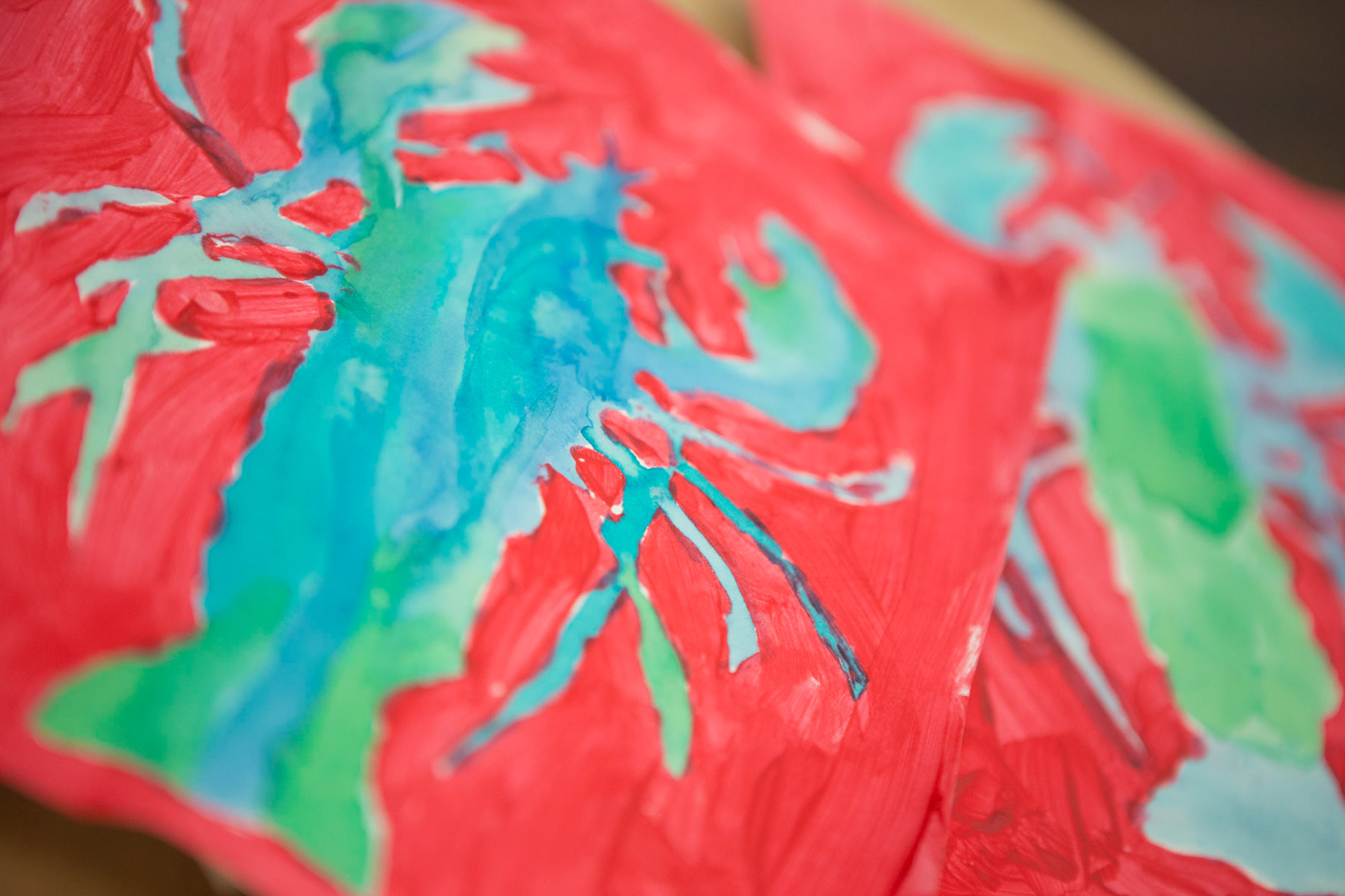
Showcasing natural tones with pops of bright color, the images are fun and indicative of the classroom environment. Details of art and daily activities bring to life the curriculum and caring nature of the staff.

Weekly enrichment classes


Students are encouraged to explore

Secure and welcoming check-in/out

Hands on teaching

Schools have a garden where students grow vegetables


